* All product/brand names, logos, and trademarks are property of their respective owners.
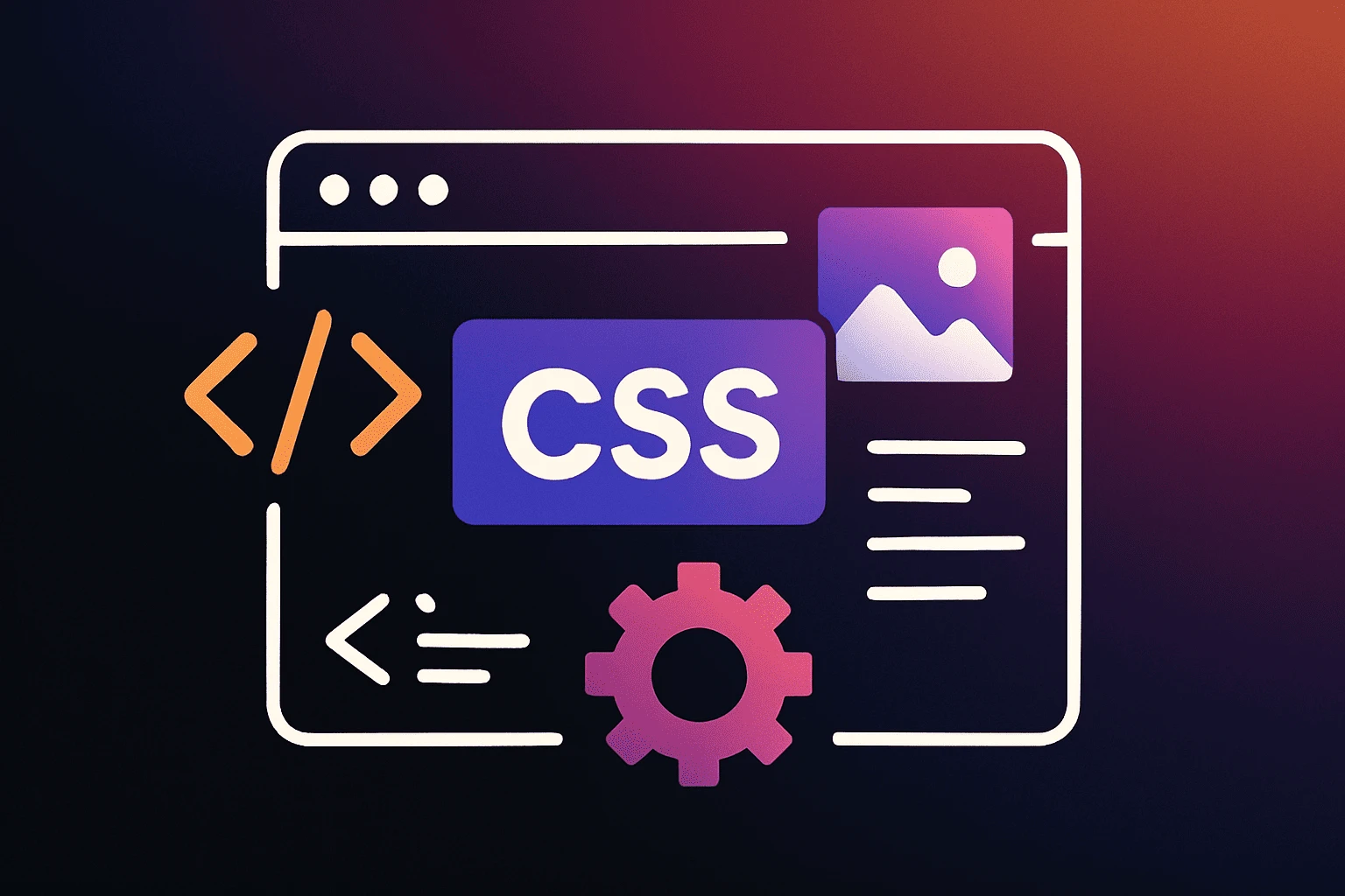
In 2025, CSS is more powerful and essential than ever. It’s no longer just about making websites look good — it’s about building fast, responsive, accessible, and modern interfaces that work flawlessly across all devices.
As web design standards evolve, front-end developers must stay updated with the latest CSS capabilities. Whether it’s layout systems like Flexbox and Grid, or newer tools like container queries and custom properties, knowing the right tricks can make a huge difference in your workflow and project quality.
In this guide, we’ll explore 25 game-changing CSS tricks every developer should know this year. From the basics to advanced techniques, these tips will help you write cleaner, smarter, and more future-ready CSS.
Gone are the days of using floats or complicated table structures. Today, Flexbox and CSS Grid are the go-to layout systems for front-end developers.
Flexbox is great for one-dimensional layouts. It helps align items both horizontally and vertically with minimal code.
Example:
display: flex;
justify-content: space-between;
align-items: center;
CSS Grid, on the other hand, is perfect for two-dimensional layouts like dashboards and galleries.
display: grid;
grid-template-columns: repeat(3, 1fr);
gap: 20px;
Mastering both will let you handle almost any layout challenge — and it’s especially useful for responsive design.
A good user experience on all devices is no longer optional. Media queries let you apply CSS rules based on screen size, orientation, and even resolution.
Example:
@media (max-width: 768px) {
  .container {
    flex-direction: column;
  }
}CSS variables make your code cleaner and easier to maintain. Think of them as reusable values that you can define once and use anywhere.
Example:
:root {
  --primary-color: #007bff;
}

.button {
  background-color: var(--primary-color);
}Scroll Snap enables smooth, snap-to-position scrolling, perfect for sliders, carousels, and full-page scroll layouts.
Example:
.scroll-container {
  scroll-snap-type: x mandatory;
  overflow-x: scroll;
}

.scroll-item {
  scroll-snap-align: center;
}
Container Queries — now fully supported in modern browsers — let you style elements based on the size of their container, not the viewport. This brings a new level of flexibility for modular design systems.
Example:
@container (min-width: 400px) {
  .card {
    flex-direction: row;
  }
}Smart CSS usage can boost your site’s performance:
Use will-change for smoother animations:
.box {
  will-change: transform;
}
Avoid heavy box shadows and large background images for better load times.
Use shorthand and minimize repetition to reduce stylesheet size:
margin: 10px 15px; /* instead of four separate margin lines */Good design is inclusive. Here’s how CSS can help:
Use prefers-reduced-motion for users sensitive to animations:
@media (prefers-reduced-motion: reduce) {
  * {
    animation: none;
    transition: none;
  }
}color-contrast() in future CSS:color: color-contrast(white vs #000, #333, #555);Avoid using display: none on important content for screen readers.
These small touches make your site more usable for everyone, everywhere.
CSS in 2025 is more powerful and versatile than ever. With features like Flexbox, Grid, scroll snap, container queries, and CSS variables, front-end developers have a robust toolkit to create responsive, accessible, and high-performance websites.
These 25 tricks are designed to help you write smarter, cleaner, and more modern CSS. Whether you're refining your layouts, boosting site performance, or improving accessibility, applying these tips will elevate your development workflow.
Put them into practice, keep experimenting, and stay updated — the future of CSS is bright, and it’s only getting better.
No bio available yet.
WordPress 7.0 marks one of the platform’s most talked-about updates, mainly because of its bui
22 May 2026
The future of web design is moving far beyond attractive layouts and modern colors. Today, a good we
4 May 2026
In today’s fast-paced digital world, a visually appealing website is no longer enough. If your
19 January 2026
Be the first to share your thoughts
No comments yet. Be the first to comment!
Share your thoughts and join the discussion below.


.webp&w=3840&q=75)


