* All product/brand names, logos, and trademarks are property of their respective owners.
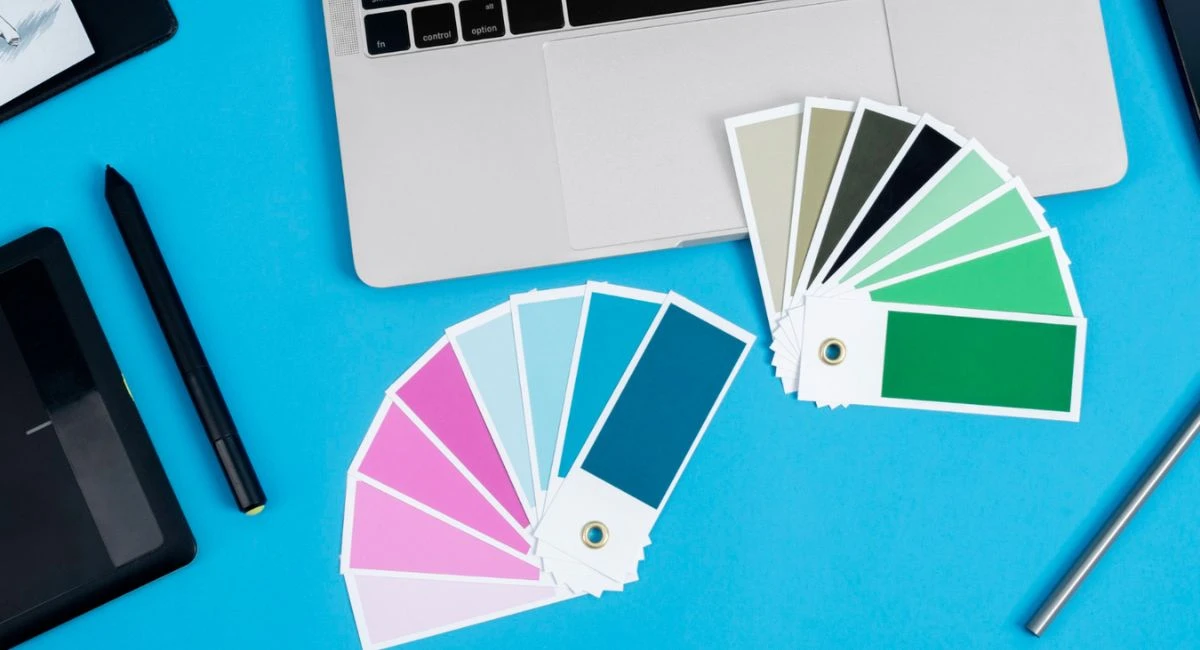
The first thing people notice about your website isn’t your headline, content, or product — it’s the color.
Color sets the tone, shapes perception, and subtly guides user behavior. The right palette can make a website feel trustworthy, modern, creative, or professional — all within seconds. The wrong one? It might send your visitors packing before they even scroll.
In today’s competitive digital landscape, your design isn’t just about looking good — it’s about standing out while staying aligned with your brand’s message. And one of the easiest ways to do that is by choosing a website color palette that enhances usability, elevates design, and leaves a memorable impression.
This guide is built to give you 8 powerful color palette ideas that are not only visually stunning but also practical and on-trend for 2025. Whether you're running a personal blog, creative agency, eCommerce store, or tech startup, you’ll find something here that fits your brand’s personality — or inspires a refresh.
We’re not just throwing colors together either. Each palette in this blog comes with:
A breakdown of its emotional effect
The industries or goals it’s best suited for
Smart tips on how to apply it effectively across your website
Plus, we’ll share design principles, accessibility tips, and free tools you can use to test and tweak your palette — so your site doesn’t just look good, but also works for everyone.
Let’s dive in and explore color combinations that truly elevate your website — from timeless and elegant, to bold and playful.
This sophisticated pairing oozes trust and refinement. Midnight blue offers a strong, calming foundation, while soft gold accents bring warmth and luxury.
Why it works: Blue is associated with stability and professionalism, making it a favorite among finance, tech, and B2B brands. The gold adds a premium touch without being flashy.
Best for: Law firms, luxury brands, consultants, online portfolios.
Pro tip: Use midnight blue for backgrounds and headers, with soft gold for CTAs, icons, and highlights.
A palette inspired by nature — think muted browns, clay reds, soft olive greens, and creamy beige. Earth tones are calming, familiar, and non-intrusive.
Why it works: These colors signal reliability, health, and comfort. They feel authentic and grounded, which is key for brands trying to build trust.
Best for: Health blogs, eco-friendly products, handmade goods, wellness brands.
Pro tip: Combine with textured images or illustrations for a cozy, lived-in vibe. Add white space to prevent a “muddy” look.
This unexpected duo strikes a perfect balance between soft and structured. Blush pink is warm and inviting, while slate grey adds depth and neutrality.
Why it works: It’s gender-neutral, modern, and clean — great for brands that want to appear approachable but still professional.
Best for: Creative agencies, personal branding sites, fashion or lifestyle blogs.
Pro tip: Use blush as the background and grey for headlines and text to keep the tone airy and balanced.
Forest green gives off strong, natural energy while ivory keeps things fresh and open. Together, they create a palette that’s equal parts relaxing and polished.
Why it works: Green signals growth, balance, and sustainability. Paired with ivory, it avoids feeling too “earthy” or dark.
Best for: Education platforms, fintech startups, NGOs, professional blogs.
Pro tip: Use forest green for buttons and navigation, and ivory as your background for a crisp, inviting layout.
This combination blends high-energy neon coral with grounding charcoal for a sleek yet electric feel. Coral grabs attention, while charcoal tones things down just enough.
Why it works: Neon hues spark urgency and youthfulness. When paired with a dark neutral, it creates contrast that’s dynamic but not overwhelming.
Best for: Startups, tech events, entertainment blogs, mobile apps.
Pro tip: Use coral for CTAs and interactive elements. Let charcoal dominate the background or menu for easy navigation.
A high-contrast duo that turns heads. Purple is traditionally linked to creativity and luxury, while yellow adds friendliness and optimism.
Why it works: It balances sophistication with cheerfulness, creating an unforgettable impression that’s both classy and lively.
Best for: Event planners, creative portfolios, design blogs, fashion brands.
Pro tip: Use yellow sparingly—too much can be overpowering. Let purple anchor the design, with yellow highlights for CTAs or icons.
Bright aqua blue and juicy tangerine create a playful, tropical vibe that instantly feels fun and approachable.
Why it works: The combo is lighthearted and youthful, making it ideal for brands that want to convey friendliness without looking too casual.
Best for: Children’s products, lifestyle blogs, food delivery, SaaS platforms with playful branding.
Pro tip: Aqua works great for backgrounds or section dividers, while tangerine pops perfectly in buttons or accent lines.
This soft-meets-bold pairing feels nostalgic but modern. Deep teal is rich and calming; peach adds warmth and personality.
Why it works: Teal’s cool tone keeps things grounded, while peach introduces a fresh, human touch. It’s unique yet accessible.
Best for: Beauty brands, creative freelancers, coaches, podcast websites.
Pro tip: Teal shines in footers and forms. Use peach in hover states, illustrations, or testimonial highlights for subtle interactivity.
Choosing a beautiful color palette is only half the job — applying it correctly is where the real magic happens. This section covers simple strategies to ensure your chosen colors not only look good but also enhance usability, brand identity, and accessibility.
This timeless design principle helps maintain balance on any page:
60%: Dominant color (e.g., background or large sections)
30%: Secondary color (e.g., headers, cards, menus)
10%: Accent color (e.g., buttons, links, icons)
Why it works: It avoids clutter and ensures your accent color pops where it matters — like your call-to-action buttons.
Color isn’t just about looks — it must work for all users, including those with visual impairments. Always run your palette through tools like:
WebAIM Contrast Checker
Colorable App
Stark (for Figma/Sketch)
Tip: Ensure your text has at least a 4.5:1 contrast ratio against its background. This not only meets WCAG guidelines but also improves readability for everyone.
Before committing, use free online tools to test combinations and generate palettes:
Pro tip: Most of these tools let you see how colors interact on sample UIs — try adjusting for dark/light mode, or responsive layouts.
A bold red might work for a gaming site but feel off on a financial advisor’s homepage. When choosing your palette:
Consider your brand voice — playful, serious, elegant, rebellious?
Think about your audience’s expectations — age group, cultural cues, purpose.
Test how the colors feel in actual layouts — not just swatches.
Bonus: Add a fourth “neutral” color (like off-white or grey) for balance and breathing space.
Choosing the right color palette isn’t just a design choice — it’s a strategic move that influences how users feel, interact, and remember your website.
We’ve walked through 8 curated color palette ideas, each designed to help your brand shine in its own way — whether you're aiming for elegance, creativity, calm professionalism, or bold fun. From Midnight Blue & Soft Gold to Aqua & Tangerine, these palettes are more than just pretty combinations — they’re powerful tools to tell your story.
But remember, it’s not only about selecting the right colors — it’s about using them consistently and intentionally. Stick to simple layout rules like the 60-30-10 principle, test your contrast ratios for accessibility, and take advantage of free tools like Coolors and Adobe Color to experiment safely before going live.
No matter your industry, niche, or website goal, color can elevate your design and bring it to life.
🎨 Now it’s your turn:
Pick one of these palettes and try it on a landing page, homepage, or blog post. Don’t be afraid to tweak — make it yours.
No bio available yet.
WordPress 7.0 marks one of the platform’s most talked-about updates, mainly because of its bui
22 May 2026
The future of web design is moving far beyond attractive layouts and modern colors. Today, a good we
4 May 2026
In today’s fast-paced digital world, a visually appealing website is no longer enough. If your
19 January 2026
Be the first to share your thoughts
No comments yet. Be the first to comment!
Share your thoughts and join the discussion below.


.webp&w=3840&q=75)


