* All product/brand names, logos, and trademarks are property of their respective owners.
In a world where attention spans are shrinking and digital experiences are everything, a beautiful user interface (UI) isn’t just a “nice to have” — it’s a competitive advantage. Whether it’s a mobile app you open 20 times a day or a website you land on while searching for something important, the first impression often comes from its design. And in 2025, that design speaks volumes.
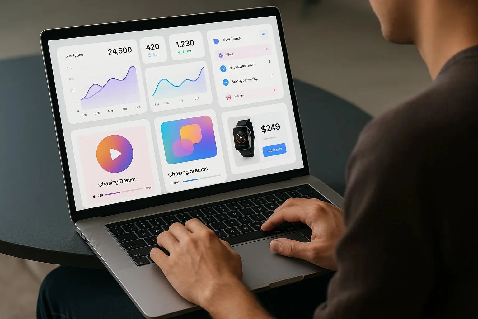
This year, the UI design world has evolved dramatically. We’re seeing interfaces that do more than look pretty — they communicate clarity, functionality, emotion, and innovation. From the soft, soothing feel of minimalist layouts to the loud brilliance of 3D graphics and bold color choices, today’s UI designers are pushing boundaries like never before. There’s a growing emphasis on personalization, too, with AI-integrated experiences adapting in real-time to user preferences. It's no longer just about static screens — it's about dynamic, responsive, and deeply engaging interactions.
But here’s what makes 2025 especially exciting: UI beauty is no longer limited to Silicon Valley or global tech giants. All around the world — including right here in Pakistan — designers are creating digital products that are not only functional but drop-dead gorgeous.
In this blog, we’ll showcase some of the most beautiful UI designs spotted this year, breaking them down into two exciting parts: jaw-dropping global inspirations and hidden gems from Pakistan that deserve way more attention. Expect real examples, expert insights, and a celebration of creativity in digital design.
So whether you're a designer looking for inspiration, a product owner aiming to revamp your app, or just a fan of good design, you’re in for a visual treat.
When it comes to breathtaking UI design in 2025, global creators are delivering experiences that are as functional as they are visually stunning. Across industries — from fintech and health to entertainment and education — these interfaces are making users stop and admire before they even click.
Here are the standout global trends we spotted:
Less is more — and some of the most beautiful UIs this year embrace that mantra. With generous white space, muted color palettes, and thoughtful typography, minimalist UI designs are helping users focus better and feel less overwhelmed.
Example:
The meditation app Calmind redesigned its interface with fewer elements, soft gradients, and gentle animations that guide users smoothly through their mental wellness journey. The result? A calming experience that feels like digital therapy.
Why it works:
Minimalism in UI reduces cognitive load, enhances focus, and creates a sense of peace — especially in fast-paced apps.
On the flip side, bold design is thriving too. We’re seeing adventurous use of vivid colors, dynamic layouts, and even 3D elements that make interfaces pop and feel immersive.
Example:
BlissPay, a European fintech app, introduced neon color schemes, micro-interactions, and real-time feedback animations — turning boring financial tasks into delightful ones.
Why it works:
These elements add personality and engagement, making the app feel alive and interactive — a big deal in otherwise “dry” industries.
Thanks to AI, UIs are now adapting to user preferences in real-time. Interfaces are becoming smarter, offering content, layout, and tools based on how each person interacts.
Example:
The learning platform Skillwise uses AI to adjust dashboard layouts based on learning behavior. Frequent users see shortcut tools; new users get guided walkthroughs.
Why it works:
AI-backed personalization creates intuitive, seamless experiences that feel tailor-made — increasing user satisfaction and retention.
Whether it’s calming minimalism, bold visual storytelling, or hyper-personalized layouts, 2025 is proving that great UI isn’t just about looks. It’s about making users feel something and guiding them effortlessly through digital spaces.
While global platforms often steal the spotlight, Pakistan’s design community has been quietly — and confidently — crafting some truly impressive user interfaces. These hidden gems not only meet international standards but often exceed expectations with their creativity, cultural nuance, and clever execution.
Let’s look at some standout examples that prove beautiful UI isn’t limited by geography.
Apps made in Pakistan have come a long way from clunky layouts and outdated visuals. Today, many local startups and developers are putting UI at the core of their product strategy.
Example:
Bykea, the popular ride-hailing and delivery app, recently refreshed its UI. The update focused on brighter visuals, streamlined navigation, and a smoother onboarding experience — making it more competitive with international platforms like Uber and Careem.
Why it works:
Bykea’s new design balances functionality with a local aesthetic, making it intuitive for first-time users while staying visually appealing.
Many Pakistani websites are stepping up their design game with clean layouts, fast-loading pages, and smart typography — and sadly, they often go unnoticed.
Example:
Markhor, a premium footwear brand, features a web interface that blends storytelling with shopping. Their product pages are simple yet elegant, using large visuals, gentle animations, and refined spacing.
Why it works:
It feels high-end without overwhelming the user. The UI reflects the brand’s ethos of quality and craftsmanship — proving design can sell.
Some of the freshest UI design work is coming from young freelance designers and students across cities like Lahore, Karachi, and Islamabad.
Example:
UI designer Areeba Khalid, a recent graduate, posted a finance dashboard concept on Behance that got global attention. Her layout showcased data visualization, dark mode elegance, and clear iconography — all tied together with a soft, modern palette.
Why it works:
The design was not just beautiful — it was usable, intuitive, and showed an understanding of both form and function.
Pakistan’s UI design scene is blooming. From established platforms to passionate freelancers, there's a growing emphasis on creating experiences that look great and feel great to use. With better access to design tools and global exposure, the gap between local and international UI standards is closing fast.
As we wrap up our visual tour through some of the most beautiful UI designs of 2025, one thing is crystal clear — great UI is no longer just about how things look. It’s about how they feel to using. The best designs this year didn’t just dazzle us with colors or layouts — they made digital experiences smoother, more human, and even joyful.
Globally, we saw innovation on all fronts — minimalist designs that calm the user, bold visual experiments that energize, and AI-powered interfaces that respond to individual needs. These trends are redefining what modern UI should strive for: clarity, emotion, and adaptability.
But perhaps most exciting is the wave of stunning design coming from Pakistan. Local creators — whether working for startups, freelancing, or still in school — are showing that world-class UI doesn’t need a Silicon Valley zip code. They’re building interfaces that are culturally aware, technically sound, and creatively bold.
If you’re a business owner, product manager, or designer, now’s the time to take a closer look at your own digital platforms. Could your app or website benefit from a UI refresh? Are you showcasing your product in the best possible light? Let the examples in this blog be your inspiration.
Beautiful UI is more than just pixels — it’s about making users feel confident, delighted, and understood.
Also Read
Top UI Design Trends to Watch in 2025

An SEO specialist with a strong focus on improving website rankings and search performance.
Experienced in keyword research, on-page optimization, and content strategy.
Skilled at increasing organic traffic and enhancing online visibility.
Uses data-driven methods aligned with search engine best practices.
Committed to delivering sustainable, long-term SEO results.
Scroll through Pinterest or Instagram for a few minutes, and you’ll start noticing a pattern&m
18 April 2026
Lately, there’s a quiet feeling many of us share, even if we can’t quite name it. We scr
21 February 2026
Whether you’re a designer building your first app or a seasoned creative working on your next
22 January 2026
Be the first to share your thoughts
No comments yet. Be the first to comment!
Share your thoughts and join the discussion below.


.webp&w=3840&q=75)


