* All product/brand names, logos, and trademarks are property of their respective owners.
Ever opened an app and felt a tiny delight when a button gently bounces, or a screen transition flows like magic? That’s motion design at work—and it's a game-changer in UI design.
If you’re just starting your journey as a UI designer, motion design can feel intimidating. Terms like “micro-interactions,” “easing,” or “Lottie” might sound complicated. But here’s the truth: you don’t need to be a pro animator to add meaningful motion to your UI. With a few simple tools and some step-by-step guidance, you can create smooth, interactive designs that elevate the user experience—and impress your clients or team.
This guide is crafted for UI beginners who want to dip their toes into the world of motion. We’ll break things down in a way that’s super easy to follow. No fluff, no jargon. Just real, practical steps.
What you'll learn in this tutorial:
What motion design actually means in the context of UI
The core principles that guide effective animations (like timing and feedback)
How to use beginner-friendly tools (like Figma) to animate a real interface
How to create a simple login screen animation with button hover effects and screen transitions
Whether you’re a freelance designer in Pakistan looking to level up your portfolio or a student trying to add “UI animation” to your skillset, this tutorial is for you. We’ll keep it hands-on, visual, and totally beginner-friendly.
By the end, you won’t just understand motion design—you’ll have your first animated UI screen ready to show off.
Let’s dive in and make your designs move!
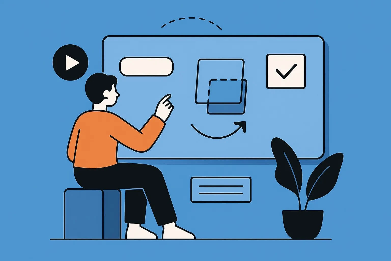
Motion design isn’t just about making things look “cool.” In UI design, it’s a functional tool that helps guide users, give them feedback, and make the experience feel smooth and enjoyable. Let’s break down what that really means.
In simple terms, motion design in UI is the use of animation to enhance how a user interacts with an interface. It’s everything from a button gently shrinking when tapped, to a loading spinner that reassures you something’s happening, to a card sliding in when you swipe.
It brings your interface to life and helps users understand what’s happening. For example, the motion gives context when a menu expands with a soft transition instead of appearing suddenly. It shows the relationship between elements, where things come from, and what’s going on behind the scenes.
Even simple animations should follow certain principles to feel “right.” Here are three beginner-friendly ones to start with:
Timing & Easing: How fast or slow something moves matters. For example, fast movements feel sharp or urgent, while slower ones feel calm and deliberate. Use easing (smooth in-and-out motion) to avoid robotic animations.
Feedback: Every user action should have a response. If someone taps a button, it should animate slightly to confirm it was pressed. This feedback creates a sense of control and satisfaction.
Clarity & Purpose: Motion should never be confusing. It should clarify actions, like sliding in a new screen, so the user knows they’ve navigated somewhere new—not just swapped content.
Remember: Motion should serve the user—not distract them.
These are small animations with a big impact. Here are a few types you’ll see often (and will build in our tutorial!):
Button hover or click animations: A little bounce, color shift, or ripple effect to show it's interactive.
Page or screen transitions: Slide, fade, or scale animations that guide the eye during navigation.
Loaders & progress indicators: Spinners, progress bars, and skeleton screens that keep users engaged.
Swipe gestures or card movements: Used in mobile UIs to make actions feel physical and intuitive.
These micro-interactions may be small, but they’re essential. They help your UI “talk” to the user—making your design feel smooth, modern, and usable.
Let’s bring everything to life now. In this step-by-step guide, you’ll design and animate a simple login screen using Figma—no coding or prior animation experience needed!
By the end of this tutorial, you’ll have a fully animated login flow, complete with button interactions and smooth screen transitions.
Before we start, here’s what you’ll need:
Figma (Free version): A browser-based design tool with built-in prototyping and animation features.
Smart Animate (in Figma): This lets you animate between frames easily, using changes in properties like position, opacity, and scale.
(Optional) Lottie: If you want to export animations as JSON for mobile/web apps later, Lottie can be used—but it’s not required for this beginner tutorial.
Sign up or log in at Figma if you haven’t already.
Let’s create two frames (screens) in Figma:
Add a rectangle (background) and name it “Login”
Add a title: “Welcome Back”
Place two input fields: “Email” and “Password”
Add a primary CTA button: “Log In”
Optional: Add a logo at the top
Duplicate the Login screen frame
Replace text with “Login Successful!”
You can animate a checkmark or success icon here
Make the button disappear or fade out
Tip: Keep your layers named consistently across frames. Figma’s Smart Animate uses matching layer names to animate properly.
Now let’s add motion:
Select the “Log In” button
In the Prototype tab, create an interaction:
On Hover → Change Fill Color or Size → Instant or Smart Animate
Preview it to see the button respond to hover!
Select the “Log In” button again
In Prototype mode, connect it to the second frame (Success screen)
On Click → Navigate to → Smart Animate → Ease In & Out → 300ms
You’ll now see the input fields fade out, and the success message fade in—smooth and simple!
You can fine-tune the easing for a bounce or delay to make it more fun
Try “Ease Out Back” for playful transitions
That’s it! You’ve just created your first motion design for UI—from static screen to interactive animation.
Now imagine applying this to splash screens, product cards, menus, and more!
And there you have it — your very first UI animation is complete! You started with just a basic idea of what motion design is, and now you've designed and animated a login screen with button hover effects and screen transitions—all using simple tools like Figma and Smart Animate. That’s a massive win, especially if you’re just starting in UI design.
This is exactly how professional UI designers bring their interfaces to life—one interaction at a time. Motion design isn’t just about looking fancy; it’s about guiding the user, offering feedback, and creating a smooth experience that feels intuitive and delightful.
Don’t stop here! Now that you’ve got the basics down, you can:
Practice animating other UI elements like menus, modals, cards, or onboarding screens
Explore tools like Lottie or Framer to take your animations to the next level
Join local communities or design groups in Pakistan (on Discord or Facebook) to share your work
Look for UI motion design jobs or internships to build your experience
Pro Tip: Download free UI animation kits or Figma templates online (or create your own) to speed up your practice and portfolio work.
Feel proud of your progress! If you'd like to keep going, read our guide on Why Figma is the Best Design Tool for New Designers in 2025 and explore more ways to level up your motion design skills. Tag us when you share your animation online!

An SEO specialist with a strong focus on improving website rankings and search performance.
Experienced in keyword research, on-page optimization, and content strategy.
Skilled at increasing organic traffic and enhancing online visibility.
Uses data-driven methods aligned with search engine best practices.
Committed to delivering sustainable, long-term SEO results.
Clients rarely arrive with perfect briefs. They say things like "make it modern," "use AI," "make it
5 June 2026
AI is now deeply woven into design tools, and Figma is one of the clearest examples. Designers are u
4 June 2026
Scroll through LinkedIn, Instagram, or even X, and one thing becomes obvious—people are paying
22 April 2026
Be the first to share your thoughts
No comments yet. Be the first to comment!
Share your thoughts and join the discussion below.


