* All product/brand names, logos, and trademarks are property of their respective owners.
Typography is more than just picking pretty fonts—it's the art and science of arranging type to make written language readable, engaging, and visually appealing. In 2025, as digital experiences dominate every screen from smartphones to smart TVs, typography has taken center stage in design conversations. Whether you’re crafting a website, building an app, or designing a brand identity, the way you use fonts can make or break your message.
This guide, Typography Basics: A 2025 Designer’s Guide to Fonts and Readability, is here to help designers—whether beginners or seasoned pros—get back to the fundamentals and stay on top of today’s trends. We’ll break down the core principles of typography, like font families, spacing, and line height, and explore what’s new in the world of type—from variable fonts and responsive typography to accessibility best practices and font pairing techniques.
Typography is the craft of arranging text in a way that’s not just readable, but also visually engaging and aligned with the message it conveys. It's a cornerstone of design, used in everything from logos and websites to packaging and presentations. But typography is more than just picking a nice-looking font. It involves making strategic decisions about size, spacing, style, and structure to guide how people read and feel about your content.
Good typography brings clarity and tone to your message. It can make complex ideas easier to digest, create mood, and even build brand trust. When used effectively, typography turns plain text into a powerful design element.
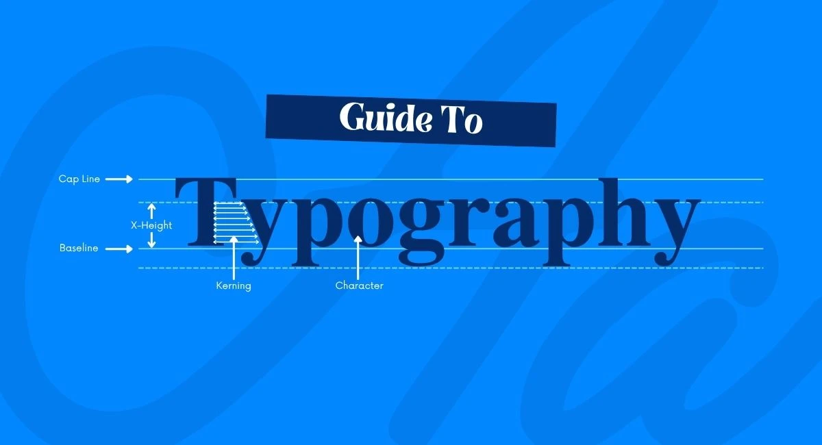
Typography relies on a set of key elements that work together to create harmony and legibility:
Font: A font is a specific style of typeface (like Helvetica Bold or Times New Roman Italic). Each font has its own personality, and choosing the right one depends on the tone you want to set—professional, casual, elegant, etc.
Kerning: This refers to the spacing between individual letters. Proper kerning ensures the text looks balanced and easy to read, avoiding awkward gaps or tight squeezes.
Leading (Line Spacing): Leading is the vertical space between lines of text. Too little, and your text feels cramped. Too much, and it feels disconnected. The right line spacing improves readability, especially in long-form content.
Line Height: Often used interchangeably with leading, line height is a CSS property that defines how tall each line of text is. In digital design, line height plays a major role in how text flows and appears across devices.
One of the first decisions in typography is choosing between serif and sans-serif fonts. Serif fonts (like Georgia or Times New Roman) have small lines or strokes attached to the ends of letters. They are often seen as traditional and formal, and they work well in print or long-form reading.
Sans serif fonts (like Helvetica or Arial), on the other hand, are clean and modern, with no extra strokes. They’re typically easier to read on screens, which is why they dominate web and mobile interfaces.
In 2025, designers often combine both styles—using a serif for headings and a sans-serif for body text—to create a balanced and dynamic layout.
Typography in 2025 is more dynamic than ever, thanks to the rise of variable fonts and the growing demand for responsive typography. Variable fonts are single font files that behave like many. They allow designers to adjust weight, width, slant, and other properties using just one file. This flexibility leads to faster load times, cleaner code, and greater creative control.
Responsive typography ensures that text scales and adjusts perfectly across all screen sizes—from tiny smartwatch displays to ultra-wide monitors. With more users accessing content on multiple devices, designers are embracing fluid typography that adapts without compromising on legibility or style. Tools like CSS clamp() and viewport-relative units (vw, vh) are making this easier than ever.
These trends are reshaping how we think about design, pushing for more intuitive and user-friendly experiences.
Choosing the right font combination is an art. A well-paired set of fonts can elevate a brand’s personality and make content feel cohesive and accessible. In 2025, the trend is toward intentional contrast—mixing fonts that are different but complementary.
Here are some go-to pairing tips:
Contrast styles: Combine a serif header with a sans-serif body (e.g., Playfair Display + Roboto).
Limit your palette: Stick to two or three fonts max to avoid visual clutter.
Match mood and purpose: Fonts should reflect the tone of your content—elegant, techy, fun, or professional.
Test across devices: Always preview your font pairs on multiple screen sizes to ensure they maintain readability and balance.
Font pairing is both a science and a creative decision—get it right, and your text becomes instantly more engaging.
As digital design evolves, accessibility has become a non-negotiable part of typography. Modern users expect inclusive experiences, and that includes text that everyone can read, regardless of visual ability.
Key best practices in 2025 include:
Minimum font size: Stick to at least 16px for body text on the web.
Contrast ratio: Ensure text stands out clearly against backgrounds (WCAG recommends at least 4.5:1).
Avoid ALL CAPS: Except in specific cases, as they reduce readability.
Clear hierarchy: Use size, weight, and spacing to guide readers through your content.
Readable line lengths: Keep lines between 50–75 characters for optimal comfort.
By aligning your typography with these accessibility standards, you not only serve a wider audience but also boost SEO and user satisfaction.
Typography is more than a visual detail—it’s a core component of communication and user experience. As we move deeper into 2025, the expectations for clean, accessible, and responsive design are higher than ever. Whether you're designing a website, app interface, brand identity, or printed material, the way you use fonts plays a crucial role in how your message is received.
We’ve explored the building blocks of typography: understanding what it is, learning how elements like kerning and leading affect readability, and choosing between serif and sans-serif fonts based on purpose and tone. We've also looked ahead—embracing variable fonts, responsive design techniques, and the importance of pairing fonts with intention. Most importantly, we emphasized the critical need for accessibility in typography, ensuring that every reader can comfortably engage with your content.
As a designer, your job is to create clarity—not just beauty. Typography is one of the most powerful tools you have to do that. By mastering the basics and keeping up with modern trends, you’ll not only improve your designs but also build more meaningful, inclusive, and user-centered experiences.
Now it's your turn—take these principles, apply them to your next project, experiment with new font tools, and see how thoughtful typography can transform your work. The words may be the same, but the way you present them makes all the difference.
No bio available yet.
You opened Canva or Figma for the first time, made something, and thought "this looks nothing like w
29 April 2026
Scroll through any design forum or beginner group, and you’ll notice a pattern—people co
27 April 2026
If you scroll through Instagram, watch a YouTube video, or even look at a product package, you&rsquo
10 April 2026
Be the first to share your thoughts
No comments yet. Be the first to comment!
Share your thoughts and join the discussion below.


