* All product/brand names, logos, and trademarks are property of their respective owners.
Accessibility and conversion are often treated like separate goals. In reality, many accessibility improvements make landing pages easier for everyone: clearer headings, readable contrast, obvious buttons, helpful form labels, predictable navigation, and fewer distracting effects.
This accessibility-first landing page design checklist is for designers who want pages that look polished and perform better because people can actually use them. It is not legal advice; it is a practical workflow for stronger UX.
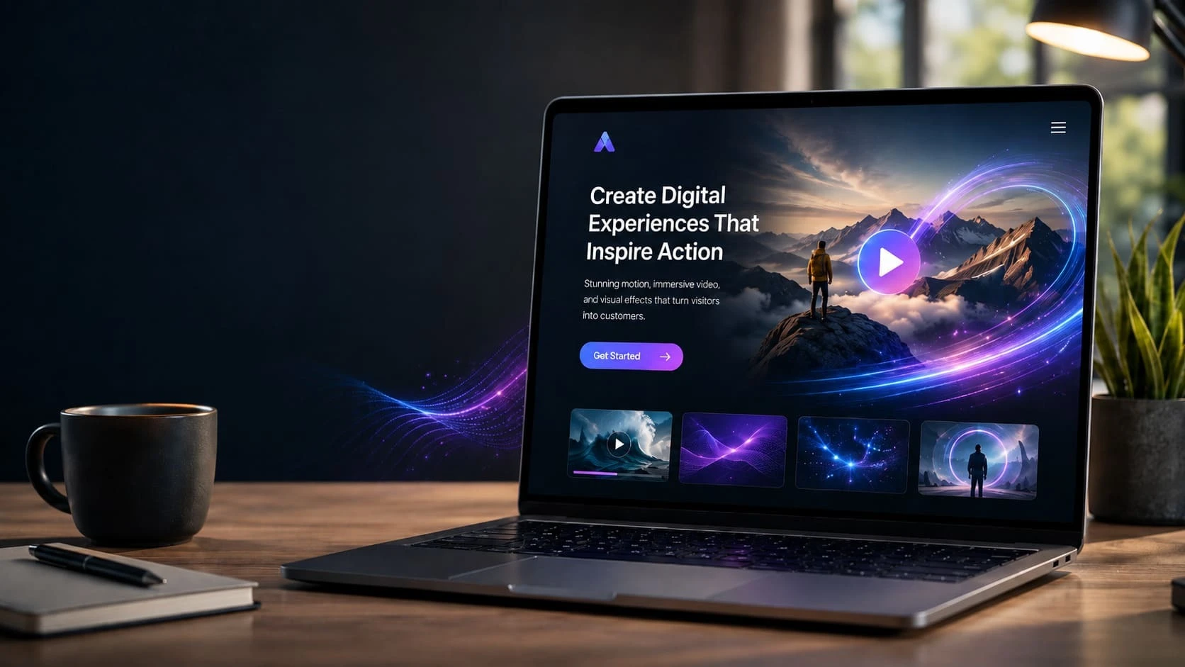
A landing page should make the offer clear before the user has to decode the design. If the headline is vague, the hero image is decorative, and the button says only "Learn more," accessibility fixes later will not save the page.
Start by writing the user's task in one sentence. Then design the page so the heading, supporting copy, proof, and primary action all support that task.
Use one clear H1, logical H2s, and short paragraphs. Screen reader users benefit from structure, but so do mobile visitors scanning. Avoid giant text blocks, hidden explanations, and headings chosen only for visual size.
Designers should check whether the page still makes sense if all visuals are removed. If the text hierarchy works alone, the design has a stronger foundation.

| Page Element | Accessibility Check | Conversion Benefit |
|---|---|---|
| Headline | Clear H1 and plain language | Users understand the offer faster |
| Contrast | Readable text and buttons | Less eye strain and missed actions |
| Forms | Visible labels and useful errors | Fewer abandoned submissions |
| Buttons | Specific text and obvious states | Cleaner decision path |
| Mobile layout | No overlap or tiny tap targets | Better completion on phones |
Forms often decide whether a landing page succeeds. Every input needs a visible label, helpful error message, a sensible keyboard order, and enough spacing for touch. Placeholder-only labels are weak because they disappear when users type.
Ask for only the information needed at that stage. A shorter form is not always better if it creates uncertainty, but every field should earn its place.
Buttons should look like buttons, not decorative pills that blend into the page. Use action-specific text such as "Book a consultation," "Download the checklist," or "Get pricing." Avoid multiple competing primary buttons in the same viewport.
Color should not be the only signal. Use contrast, shape, placement, and text to make the action clear.
Motion can guide attention, but it can also distract or make people uncomfortable. Avoid auto-playing effects that block reading. Provide controls for video, keep animations subtle, and respect reduced-motion preferences where possible.

The goal is not a flat page. The goal is a page where visual energy supports the decision instead of fighting it.
Before handoff, include contrast notes, focus states, form error states, mobile wrapping behavior, alt text guidance, and content hierarchy. Developers should not have to guess what happens when text is longer, a field has an error, or a user tabs through the page.
Accessibility-first design is not extra polish. It is part of making the landing page usable, trustworthy, and ready for real traffic.
Before a landing page goes live, run a few simple tests. Navigate the page with a keyboard and confirm that focus states are visible. Zoom the page and check whether the content still fits. Read the page on a phone in bright light and see whether contrast and button size remain comfortable. Submit the form with missing information and judge whether the error message is helpful.
Turn off images mentally and ask whether the offer still makes sense from the text. These checks do not replace a full accessibility audit, but they catch many common design mistakes. They also make the page feel more professional for every visitor, not only users with assistive technology.
Before presenting the page, designers should ask five review questions. Can a first-time visitor understand the offer in five seconds? Does every section move the user closer to a decision? Are testimonials, proof, or examples close to the claims they support? Can the form be completed without guessing? Does the mobile version preserve the same priority as the desktop?
These questions are practical because they connect accessibility to business outcomes. A page that is easier to read, navigate, and submit is usually easier to convert on. Accessibility-first design should therefore be presented to clients as quality work, not as a compliance burden added after the visual design is finished.

Keep a screenshot record of desktop and mobile states before launch. It helps teams compare future changes and catch regressions quickly.
This guide is for readers of edesignify.com who want practical, current advice on accessibility-first landing page design without hype or unnecessary jargon.
Start with the checklist or table in the article, then verify any time-sensitive requirement with the relevant official source or local professional before spending money.
The topic was selected because it matches the website niche, has current search interest, and can solve a real reader problem instead of only summarizing a trend.
No. The article is written to follow helpful-content principles and satisfy search intent, but search performance is never guaranteed.

Feroza Arshad is a writer and content creator covering a range of subjects including news and current affairs, automobiles, sports, technology and coding, digital marketing, and Google and search trends. Her work appears across several blogs and publications. She focuses on clear, well-researched, and genuinely useful writing — breaking down developments, reviewing products, and explaining technical topics in plain language anyone can follow.
UI/UX Design in 2026 is not just evolving. It is shifting at a pace that feels hard to ignore. New t
21 April 2026
Have you ever opened an app and instantly felt confused? Maybe you couldn’t find the button yo
8 April 2026
In the world of UI/UX design, shipping new features often feels like progress. A new button, a redes
7 February 2026
Be the first to share your thoughts
No comments yet. Be the first to comment!
Share your thoughts and join the discussion below.


