* All product/brand names, logos, and trademarks are property of their respective owners.
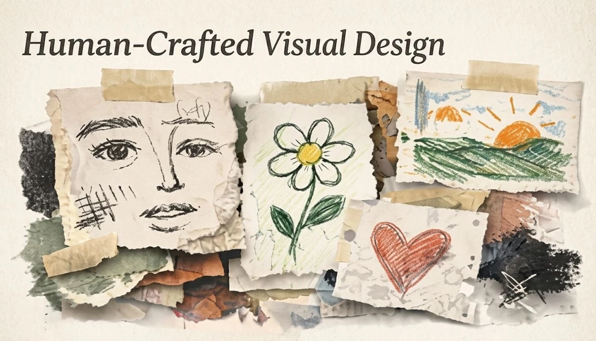
After years of polished templates, perfect gradients, and AI-smooth visuals, many brands are looking for design that feels more human. Texture, hand-drawn marks, warmer photography, imperfect illustration, and tactile details are showing up across visual systems. The opportunity is real, but so is the risk. Human-crafted visual design in 2026 should add trust and personality without making the interface harder to use.
The best work will not simply look handmade. It will feel intentional. It will support the message, respect accessibility, and help users understand what to do next.
When many digital experiences start to look the same, small signs of human craft become valuable. A textured background, custom icon, editorial photograph, or imperfect line can make a brand feel less generic. For service businesses, creators, restaurants, lifestyle brands, and portfolios, this can build warmth quickly.
But texture is not automatically good design. Too much visual noise can reduce readability. Decorative details can slow pages, distract from calls to action, or clash with product UI. The goal is personality with restraint.
| Design area | Good use | Risk to avoid |
|---|---|---|
| Hero sections | Brand photography, paper grain, crafted illustration | Busy backgrounds behind important text |
| Icons | Custom line style with consistent stroke | Random icon styles from different packs |
| Cards and panels | Subtle borders or shadows | Decorative clutter in dense dashboards |
| Packaging or portfolio pages | Process photos and material details | Over-filtered images that hide the work |
| Marketing graphics | Collage, handmade marks, expressive type | Unreadable typography on mobile |
Process content should still be edited. Do not dump every photo or sketch into the page. Choose the moments that explain quality, effort, and decision-making.

The first test for any visual trend is simple: can people still read and use the page? Keep body text on clean surfaces. If you use texture behind text, lower its contrast and test it on mobile. Strong craft does not require sacrificing clarity.
Human-crafted design is strongest when it connects to the brand's real process. A bakery can show dough, flour, handwritten labels, and warm photography. A designer can show sketches, rejected marks, grids, and prototype notes. A handmade clothing brand can show fabric texture and stitching. A SaaS dashboard, however, may need far less decoration and more trust-building clarity.
Ask what the user needs to believe. If the answer is "this product is careful and personal," craft details help. If the answer is "this platform is secure and efficient," use craft more subtly.
AI tools can help generate visual directions, but they can also flatten taste. Designers should use AI to explore, then add specific brand logic: real materials, real constraints, real audience needs, and real content. The difference between generic and memorable often comes from the details AI cannot know unless you provide them.
Build a small visual language guide: texture level, illustration style, photography rules, type pairings, color behavior, icon stroke, motion personality, and accessibility limits. This keeps craft from becoming random decoration.
Warm design should include everyone. WCAG-aware decisions are especially important when using expressive color, motion, and illustration. Avoid relying on color alone to communicate status. Provide clear focus states. Respect reduced-motion preferences. Make sure decorative images have appropriate alt handling, while meaningful images get useful descriptions.
Human-crafted visual design in 2026 is not about making everything messy or nostalgic. It is about giving digital work a clearer point of view. Use texture, illustration, and handmade details where they support trust, story, and memory. Keep the interface clear, accessible, fast, and easy to act on. That is how personality becomes good UX.

A texture scale helps teams decide how expressive a page should be. Level one might be a clean product UI with almost no texture. Level two might add subtle grain, custom icons, or warmer photography. Level three might use collage, expressive typography, and handmade illustration for campaigns or editorial pages.
This prevents a common problem: every designer interpreting "more human" differently. A shared scale keeps brand expression consistent across landing pages, social graphics, packaging, and product screens.
Human-crafted visuals become more persuasive when users can see the process. Portfolio pages can show sketches, grid development, rejected marks, or behind-the-scenes photography. Product brands can show materials, prototypes, workshops, or real environments. This builds trust because the audience sees evidence of care.
Process content should still be edited. Do not dump every photo or sketch into the page. Choose the moments that explain quality, effort, and decision-making.
Expressive visuals often fail on mobile when details become cramped. Test handmade type, collage, and textures on small screens before approving them. A poster-style composition may work beautifully on a desktop but become unreadable on a phone. Mobile-first craft uses fewer details, stronger contrast, and clearer hierarchy. Keep one expressive moment per view instead of stacking many competing effects.
Not every interface needs personality at every moment. Checkout flows, forms, settings pages, and admin dashboards usually need calm clarity. Save expressive craft for places where it supports emotion, storytelling, or brand memory. The best design systems know when to speak and when to get out of the user's way.
This restraint is what separates mature visual direction from decoration. A single crafted detail in the right place can feel more premium than a page full of effects.
Clients may like the idea of warmer, more human visuals but worry that it will make the brand look less professional. Explain the business value in plain terms: distinction in crowded feeds, stronger memory, more authentic storytelling, and better emotional fit for the audience. Then show controlled examples instead of abstract mood boards only.
Offer two or three levels of expression. A conservative client may choose subtle texture and custom photography. A creative brand may choose expressive illustration and bolder typography. Giving options makes the direction feel safer.

When handing off a human-crafted design direction, include practical rules the client can reuse. Define approved textures, image treatment, illustration limits, typography rules, and accessibility checks. This prevents the visual style from weakening after the first campaign.
Also, explain where the style should not be used. A clear boundary helps future designers, developers, and marketers protect both usability and brand character.

Feroza Arshad is a writer and content creator covering a range of subjects including news and current affairs, automobiles, sports, technology and coding, digital marketing, and Google and search trends. Her work appears across several blogs and publications. She focuses on clear, well-researched, and genuinely useful writing — breaking down developments, reviewing products, and explaining technical topics in plain language anyone can follow.
AI video tools are moving fast, and Kling AI 3.0 is one of the latest updates getting attention from
23 May 2026
Some Instagram photos just hit differently. You scroll past dozens of posts, then suddenly one stops
20 April 2026
Be the first to share your thoughts
No comments yet. Be the first to comment!
Share your thoughts and join the discussion below.


