* All product/brand names, logos, and trademarks are property of their respective owners.
Dark mode has rapidly evolved from a trendy design option to a must-have feature across digital platforms. From operating systems and mobile apps to websites and professional software, it’s clear that users love the sleek, minimal, and modern feel of a dark interface. But here’s the thing — dark mode isn’t just about looking good. When done right, it can enhance readability, reduce eye strain, and improve battery efficiency on OLED screens.
However, designing a dark UI isn’t as simple as flipping a color switch. There’s a delicate balance between making an interface stylish and ensuring it remains accessible to all users. Dark mode can easily go wrong — poor contrast, harsh colors, and low legibility are just a few common pitfalls. That’s why thoughtful planning is essential.
This blog will walk you through the best practices for designing dark mode interfaces that are both visually appealing and highly usable. We’ll focus on two key areas: accessibility — because every user deserves a seamless experience — and style, to help your design stand out without compromising on function.
Whether you're a UI/UX designer creating your first dark theme, or a developer refining a multi-mode app, this tutorial will equip you with practical tips, visual guidance, and design principles to get it right.
Ready to dive in? Let’s explore how to make dark mode not just look good — but work well too.
Designing with dark mode in mind isn't just about keeping up with the latest trends — it's about ensuring your interface works for everyone, regardless of visual ability, device, or environment. Accessibility in dark mode is critical because the wrong design decisions can quickly turn a sleek interface into an unusable one.
Let’s break down why accessibility should be a core focus when building dark interfaces:
There’s a common misconception that dark mode is always easier on the eyes. While it’s true that reduced screen brightness can lower eye strain in low-light conditions, reading light text on a dark background actually presents different cognitive and visual challenges.
Our eyes are naturally more accustomed to reading dark text on a light background (positive polarity). In dark mode (negative polarity), the pupils dilate more to absorb light, which can slightly reduce the sharpness of the text and cause fatigue over time. This makes contrast and font clarity even more crucial.
Here are some common mistakes designers make when crafting dark mode:
Poor Contrast Ratios: Light gray on dark gray might look clean but can be unreadable for many users, especially those with visual impairments.
Color-Only Indicators: Relying solely on color cues (e.g., red for errors, green for success) can alienate colorblind users.
Improper Focus States: Users navigating via keyboard or screen reader often miss focus indicators if not well-designed for dark backgrounds.
Accessibility isn't just about ticking a box — it's about creating equal access to information.
To stay inclusive, align your dark UI with WCAG (Web Content Accessibility Guidelines). Here are a few actionable tips:
Maintain a contrast ratio of at least 4.5:1 for normal text and 3:1 for large text.
Use text shadows or subtle glows to increase legibility without overpowering.
Ensure interactive elements are distinguishable, with clear hover and focus states.
Avoid pure black (#000000); deep gray tones are easier on the eyes and provide more flexibility for shadows and borders.
Accessibility isn’t optional — it’s foundational. Building with it in mind ensures that your dark mode is not just cool, but also truly user-friendly.
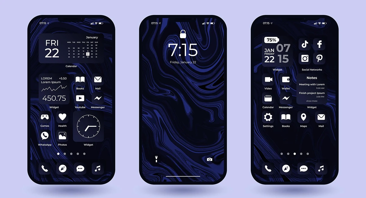
Creating a dark UI that looks good is only half the job — the real challenge lies in making sure it’s also intuitive, consistent, and functional across devices. A well-designed dark interface should enhance the user's experience, not make them struggle to read, click, or navigate.
Here’s how to get the design details right:
A successful dark mode starts with a well-balanced palette. The base background should never be pure black — instead, use a soft charcoal or deep gray (like #121212 or #1E1E1E). These tones feel less harsh and provide more flexibility for layering content.
Accent colors are your best friends here — but use them sparingly. Blues, teals, or purples often work well against dark backgrounds. Ensure these colors are tested for visibility and legibility, especially when used for calls-to-action, alerts, or links.
Pro tip: Build a color system with semantic tokens (like primary, secondary, warning) so you can easily switch themes without redoing your entire palette.
In dark mode, typography does a lot of the heavy lifting. You want your text to stand out, but not glow like a neon sign. Off-white tones like #E0E0E0 are easier to read than pure white, which can create visual fatigue.
Use clear, sans-serif fonts with adequate spacing. Larger line heights and generous padding between text blocks can significantly improve readability. Make sure heading sizes and weights create a strong hierarchy, helping users scan content effortlessly.
Also, avoid using overly thin fonts — they tend to disappear against dark backgrounds and create a ghost-like effect.
Just like in light mode, a solid visual hierarchy is essential in dark mode to guide users. Use shadows and elevation (not just color) to separate elements like modals, cards, and toolbars.
For example:
Use subtle shadows under elevated elements to add depth.
Employ dividers or borders in slightly lighter/darker shades of gray to distinguish sections.
Keep icons, buttons, and inputs visually consistent with spacing and size.
Motion and micro-interactions (like hover states and transitions) also help reinforce interactivity and polish.
When done well, a dark UI can feel sleek, immersive, and deeply engaging — all while being functional and inclusive.
Dark mode has become more than just a visual preference — it’s a standard design expectation across digital products. But designing it right means going beyond aesthetics. It requires thoughtful choices that prioritize accessibility, usability, and consistency.
We explored how important it is to ensure your dark mode design meets accessibility standards — from choosing the right contrast ratios to avoiding color-only indicators. We also broke down the core design principles that help make a dark UI both beautiful and user-friendly: a smart color palette, readable typography, and clear visual hierarchy.
The key takeaway? Dark mode isn’t a “copy-paste” of your light design — it deserves its own intentional treatment. Whether you're designing for web, mobile, or cross-platform applications, always test your designs with real users, use accessibility tools to validate contrast and structure, and never underestimate the power of subtlety in dark environments.
Looking to bring your dark UI to life?
Consider building a checklist based on today’s tips — or better yet, download a dark mode accessibility toolkit to speed up your design process.
No bio available yet.
Clients rarely arrive with perfect briefs. They say things like "make it modern," "use AI," "make it
5 June 2026
AI is now deeply woven into design tools, and Figma is one of the clearest examples. Designers are u
4 June 2026
Scroll through LinkedIn, Instagram, or even X, and one thing becomes obvious—people are paying
22 April 2026
Be the first to share your thoughts
No comments yet. Be the first to comment!
Share your thoughts and join the discussion below.


