* All product/brand names, logos, and trademarks are property of their respective owners.
Designing user interfaces can be a repetitive process—especially when you're creating similar buttons, cards, headers, or layouts over and over again. This is where Figma reusable components become a game-changer. Whether you're working on a small personal project or collaborating on a large-scale design system, mastering components in Figma helps you streamline your workflow, stay consistent, and make updates in seconds rather than hours.
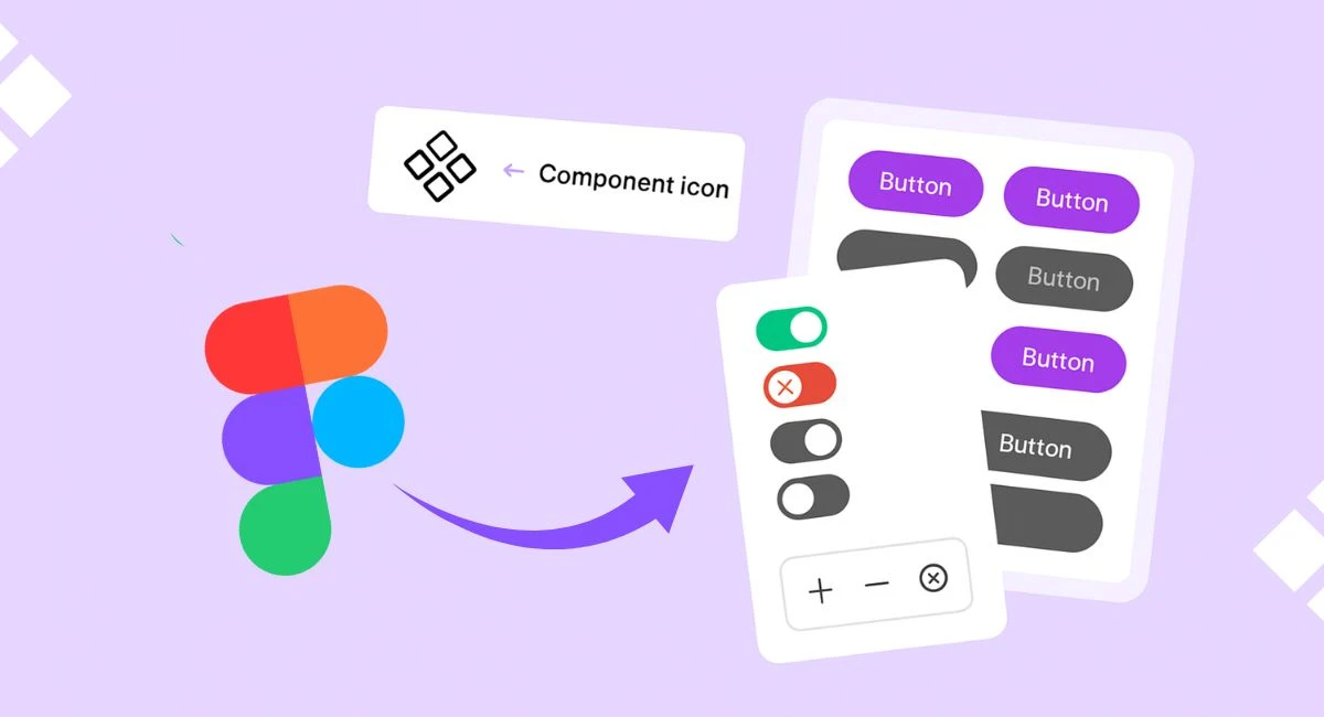
Figma, a cloud-based design tool, has rapidly become the go-to platform for UI/UX designers worldwide. Its power lies not just in its intuitive interface but in its deep support for components, instances, and variants—features that let you design smarter and faster. Reusable components in Figma allow you to create a "master" element, such as a button, which can then be reused across your entire design project. When you update the master, every instance of it updates automatically—saving you time and ensuring consistency throughout your design.
This blog will walk you through everything you need to know about creating reusable components in Figma. We’ll start by understanding the foundational concepts, like what components and instances are, and why they’re essential. Then we’ll move on to hands-on steps: how to create them, how to organize them effectively in libraries, and how to use Figma's powerful variant and auto layout features to make your components more flexible and dynamic.
Whether you're a beginner exploring Figma for the first time or a seasoned designer looking to improve your workflow, this guide will equip you with practical insights and tips that you can start using right away.
A Figma Component is like a master blueprint. It’s the original version of a design element that you can reuse multiple times across your project. When you use that component elsewhere, it creates what's called an instance. Think of a component as a cookie cutter and each instance as a cookie—it’s the same shape, but you can decorate each cookie a little differently without changing the cutter.
For example, if you design a primary button as a component, you can reuse that button on every screen. Need to change the button color or label? Simply update the main component, and every instance across your file will update automatically. This not only saves time but also ensures design consistency across your project.
Using reusable components in Figma comes with major workflow benefits:
Consistency: With components, your design elements always stay aligned with your style guide.
Efficiency: Make changes once, and apply them everywhere—no more manually updating each screen.
Collaboration: Components help team members work with clarity and confidence, especially in large teams.
Scalability: As your project grows, you won't have to rebuild the wheel every time you need a similar element.
Let’s say you're building a dashboard. Instead of copying and pasting the same card layout for every widget, you can build one component and reuse it. If you ever need to tweak the design, just change the main component—it updates everywhere.
Variants take components to the next level. They allow you to group related components together under one umbrella and toggle between their states. For instance, instead of having separate components for “Button: Default,” “Button: Hover,” and “Button: Disabled,” you can create a single button component with variants for each state.
This not only makes your component library cleaner but also makes prototyping faster and more dynamic. When designing interactive mockups, you can easily switch between variants to simulate different user interactions without rebuilding your designs from scratch.
Creating a reusable component in Figma is easier than you might think. Start by designing any UI element you want to reuse—this could be a button, card, form field, or even an entire layout block. Once you’re happy with the design:
Select the element.
Right-click and choose “Create Component” (or press Cmd/Ctrl + Alt + K).
Your element is now a component, with the purple outline that indicates it’s the main (or “master”) version.
You can now drag instances of this component from the Assets panel into your frames. Whenever you update the master component, those instances will automatically reflect the changes. It's a simple process, but it unlocks powerful scalability for your projects.
As your project grows, managing components in a single file can get messy. This is where Figma component libraries come in handy. You can group your components into a dedicated file and publish it as a team library, allowing others to reuse your components across different projects and files.
Here’s how to create a component library:
Create a new Figma file and design all your components there.
Use clear, consistent naming (e.g., Button/Primary, Button/Secondary, Form/Input/Default).
Go to the Assets panel, click the library icon, and enable “Publish Library”.
Now, any team member can access and use your components by enabling the library in their own projects—great for maintaining consistent branding and design systems across teams.
A well-organized component system is a joy to use—and a nightmare if neglected. Here are some best practices for structuring your reusable components:
Use slashes for hierarchy: Naming a component Button/Primary/Small helps Figma auto-organize your assets in folders.
Group similar variants: Keep related states (e.g., hover, disabled) under one component using variants.
Document usage: Consider adding a description or a usage guide inside your Figma file to help other team members understand how to use the components.
Keep things modular: Design components to be flexible and modular. Avoid hardcoding values like text or images—leave them editable in the instance.
With these practices, your Figma files will remain clean, efficient, and scalable—even as your design system evolves.
Creating reusable components in Figma isn’t just a productivity hack—it’s a smart design strategy that helps you build scalable, consistent, and high-quality interfaces. Whether you’re designing a simple landing page or an entire product ecosystem, components allow you to keep your work organized and responsive to change.
We started by understanding what components and instances are, how they work, and why they’re essential to any modern design system. Then, we explored the power of variants to keep related components unified under a single umbrella—making your workflow smoother and your files cleaner.
Next, we walked through the step-by-step process of actually building your first reusable component, organizing them into libraries, and following best practices for naming and structure. These habits are what separate a cluttered, chaotic design file from a streamlined, professional-grade system.
By integrating components into your design process, you’re not just saving time—you’re future-proofing your work. As projects grow and evolve, having a solid component system will make updates painless, collaborations easier, and your designs more polished.
🎯 Now it’s your turn!
Start building your own component library in Figma. Experiment with variants, practice naming conventions, and share your system with your team. You’ll be amazed at how much more efficient and enjoyable your design process becomes.
No bio available yet.
Clients rarely arrive with perfect briefs. They say things like "make it modern," "use AI," "make it
5 June 2026
AI is now deeply woven into design tools, and Figma is one of the clearest examples. Designers are u
4 June 2026
Scroll through LinkedIn, Instagram, or even X, and one thing becomes obvious—people are paying
22 April 2026
Be the first to share your thoughts
No comments yet. Be the first to comment!
Share your thoughts and join the discussion below.


