* All product/brand names, logos, and trademarks are property of their respective owners.
In today’s hyper-visual world, design is everywhere—on websites, apps, social media, and printed materials. But with thousands of free and paid graphics available at a click, one big question remains: how do you know if a graphic is truly premium?
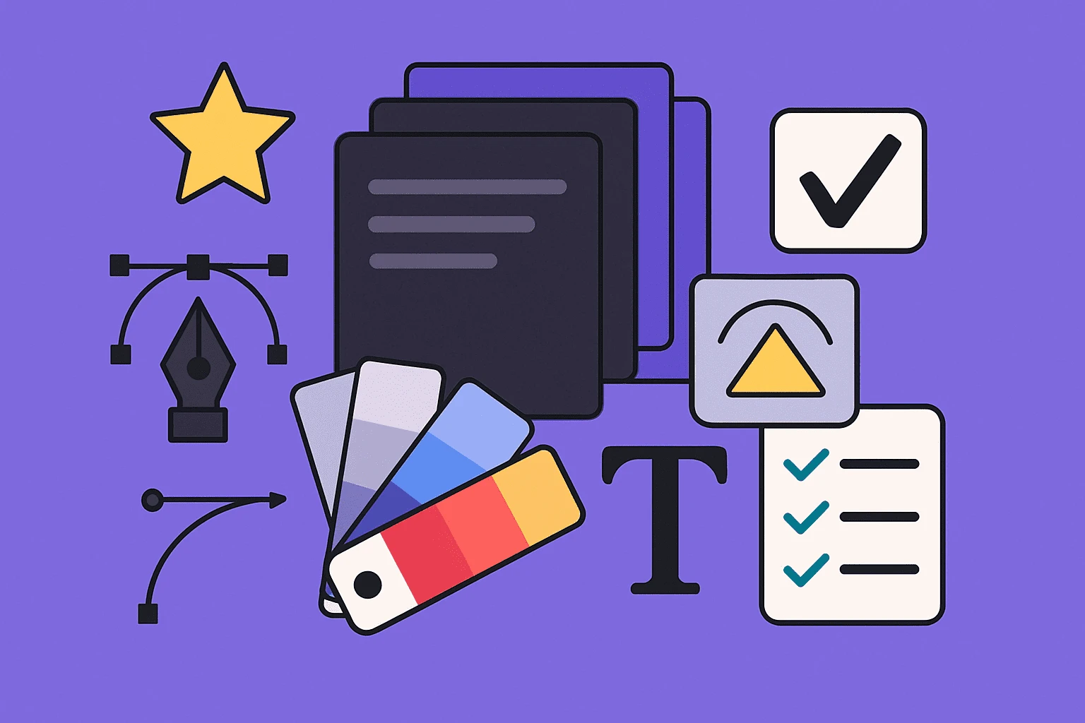
Enter the Premium Stack Graphic Design Checklist—a go-to guide crafted for designers, marketers, and creative teams who value quality over quantity. Whether you’re building a visual identity, preparing brand materials, or just curating a cohesive design pack, knowing what separates a top-tier graphic from an average one is essential.
But let’s first break it down: what exactly is a stack graphic? In simple terms, it’s a bundled set of visual assets—icons, illustrations, templates, UI elements, or branding pieces—designed to work together in a unified theme. Think of it like a premium toolbox, where every component is built with intention, precision, and reusability in mind.
Unfortunately, many so-called “premium” files fall short. They may look appealing at first glance, but dig deeper and you’ll find poor organization, flattened layers, inconsistent styles, or non-scalable formats. These hidden flaws slow down workflows, compromise design quality, and reflect poorly on your brand.
That’s why we created this comprehensive checklist: to help you spot true visual excellence. From file structure and typography to color consistency and layout harmony, we’ll break down exactly what makes a stack graphic truly premium—and how to vet assets before you invest your time, money, or brand reputation.
Whether you're downloading assets or designing your own, this guide will equip you with practical tips and real-world examples to ensure you’re always working with the best.
Let’s dive in.
A stack graphic isn’t just a single image—it’s a cohesive bundle of design assets grouped to work together seamlessly. These might include logo templates, icon packs, illustrations, UI elements, infographics, or branded visuals. They're often sold or shared as collections for easier project integration.
Designers use stack graphics to speed up production without compromising quality. For example, a startup creating its pitch deck might grab a premium stack of icons, while a marketing agency could rely on a visual kit for social media posts. These stacks save time—but only if the graphics are well-designed, scalable, and consistent in style.
The word “premium” is tossed around a lot in the design world. But in reality, it means far more than a fancy aesthetic or high-resolution preview. Premium implies professional-grade usability.
A premium graphic should be editable, scalable, logically layered, visually balanced, and aligned with modern design standards. It should offer flexibility—so it can be customized to different brands, formats, and platforms. Premium also means time-saving: the files should be ready to use, not require fixing or cleaning up.
Think clean vector paths, smart use of fonts, thoughtful spacing, and intentional color schemes. Every pixel has a purpose.
Here’s the catch: not everything labeled “premium” lives up to that promise. Some sellers slap the label on any bundle with trendy colors or polished thumbnails, even if the files inside are low-res, poorly structured, or impossible to edit.
That’s why a reliable checklist is so important. Visual polish is just surface-level. True premium quality lives in the details—how files are constructed, how flexible they are for different use cases, and how consistently they align with a design system.
A beautiful mess is still a mess. And in the fast-paced world of digital design, that’s something you can't afford.
This is where the real quality test begins. Below are the essential elements that separate average stock assets from true professional-grade stack graphics.
A premium graphic should be delivered in versatile, high-quality file formats. Look for vector files like AI, EPS, or SVG—these maintain quality at any size and allow endless customization. For layered designs, PSD or XD formats are key. Avoid bundles that only provide flattened JPGs or PNGs; these might look nice but offer zero flexibility.
Great stack graphics are designed with real-world use in mind—whether you're working in Adobe Illustrator, Figma, Canva, or web environments. Always check that the assets are compatible with your design tools before purchase or download.
One of the biggest frustrations in design? Downloading a so-called premium file that’s a tangled mess of unnamed layers—or worse, fully flattened with no editable components.
A well-built premium file should have:
Clearly named layers
Smart objects for scalable content
Organized groups (icons, text, backgrounds, etc.)
No hidden surprises or locked items
This isn’t just about cleanliness—it’s about saving time and stress. Structured layers mean faster edits, smoother client revisions, and a better overall design workflow.
In design, size matters—and poor scalability is a silent killer of quality. Premium graphics must maintain crisp edges and perfect proportions whether you print them on a billboard or shrink them to an app icon.
Here’s what to check:
Vectors should scale without any loss of quality.
Raster images should be at least 300 DPI for print and properly optimized for screen use.
Assets should be export-ready in multiple sizes and aspect ratios.
Avoid graphics that break, blur, or pixelate under pressure. Scalability is the backbone of long-term usability.
Technical quality is the foundation—but visual excellence is what truly makes a graphic feel premium. Here's what sets standout designs apart from the crowd.
Great design isn’t just about images—it’s also about typography. A premium stack graphic pays close attention to type: font pairings are intentional, spacing is precise, and legibility is never compromised.
Even more important: font licensing. Legitimate premium graphics either embed licensed fonts or include instructions on where to download them legally. Be wary of bundles that throw in free or pirated fonts—they can lead to copyright issues or inconsistencies in your brand.
Look for:
Font hierarchy (headline, subtext, caption)
Readability at all sizes
Font source/link and usage rights included
Premium design is as much about what’s left out as what’s included. While novice designs might feature overly bright or mismatched colors, premium assets tend to use intentional, minimal color palettes.
The best graphic stacks:
Stick to 3–5 core colors
Use shades and tints for depth
Ensure strong contrast and accessibility
Allow for easy color changes using swatches or global styles
Good color choices evoke emotion, align with brand identity, and ensure legibility across devices.
Ever looked at a design and thought, “Something just feels off”? That’s usually a layout problem. Premium graphics respect grids, alignment, white space, and visual rhythm.
What to look for:
Balanced spacing and symmetry
Aligned elements (icons, text, shapes)
Hierarchical layout guiding the eye naturally
Great composition isn’t flashy—it’s functional. A well-laid-out asset doesn’t just look good; it helps communicate ideas more effectively.
Even if individual graphics look good, a lack of visual unity can break the entire set. True premium stacks aren’t just a pile of good designs—they’re a cohesive system built for scalability and branding alignment.
Every graphic in a premium stack should feel like it belongs to the same visual family. That means:
Matching moods (minimalist, corporate, playful, etc.)
Aligned aesthetic style (flat design, 3D, gradient-rich, line-based)
Consistent design language (icon sizing, stroke weight, corner rounding)
Disjointed themes confuse viewers and make it harder to maintain visual branding. With premium stacks, your audience should feel seamless flow—not jarring jumps between styles.
Let’s say your stack includes social icons, UI elements, and illustrations. Premium quality means all of them:
Use the same stroke width or fill approach
Share uniform dimensions and proportions
Align visually in terms of spacing and padding
Inconsistent icons or elements (like mismatched line thicknesses or color schemes) scream amateur. A good premium stack feels designed by one hand—even if multiple designers contributed.
It’s the small details that often save the most time. Premium files are clean under the hood—meaning:
Layers and folders are properly named and grouped
Export sizes are clearly labeled (e.g., “logo-512px.png”)
Files include readme.txt or metadata (e.g., color codes, font usage)
This attention to internal hygiene ensures faster onboarding for teams, fewer revision errors, and future-proof organization. Designers shouldn’t need to “decode” what each layer or asset is supposed to be.
It's one thing to know the theory—but it's far more powerful when you can apply it. Here's how to tell a true premium asset from a generic one using real-world comparisons and quick visual tests.
Let’s imagine two icon sets.
Generic Set: Icons are inconsistent in stroke width, use slightly different corner radii, and spacing is uneven. There’s no alignment grid, and the naming of files is random or missing altogether.
Premium Set: Every icon is pixel-perfect, stroke weights are uniform, icons align flawlessly on a grid, and file names are clean and descriptive.
This kind of contrast is common across other types of assets too—social media templates, brand kits, or infographic elements.
What to look for in comparisons:
Does the visual style feel cohesive across assets?
Are color choices refined and balanced?
Is there a clear system behind spacing, layout, and alignment?
When viewed side-by-side, a premium set should immediately stand out—not just for beauty, but for consistency and usability.
Want to test whether a graphic is truly premium? Run these simple checks:
Open the file and inspect layers: Are they named and organized? Or is everything merged and messy?
Try scaling the file: Do vectors stay sharp? Do raster graphics blur or pixelate?
Swap out a color or font: Can you do this easily? Or is everything locked and difficult to modify?
Export a component: Does the output match the quality you expected? Or are elements misaligned and blurry?
Bonus tip: Use tools like Figma, Illustrator, or Photopea to test compatibility, especially if you're working with a team across different platforms.
Premium isn’t just about how a design looks at first glance. It’s about how well it performs under pressure—when you open it, edit it, and actually use it in real projects.
In the fast-moving world of design, the difference between “good enough” and truly premium is in the details—and those details matter more than ever. Whether you’re a freelance designer building brand kits or a marketing team curating digital assets, choosing high-quality graphics isn’t just about aesthetics. It’s about efficiency, consistency, professionalism, and how your brand shows up to the world.
Through this Premium Stack Graphic Design Checklist, we’ve broken down the essential markers of excellence:
From editable vector files and clean layer structures
To visual harmony, typography, and color sophistication
To stack-wide consistency, export hygiene, and practical usability tests
When you apply this checklist, you’re not just buying or using graphics—you’re investing in assets that will save you time, impress your clients, and elevate your brand presence.
Remember: “premium” isn’t a marketing buzzword—it’s a standard. And with the right knowledge, you’ll never settle for less again.
No bio available yet.
You opened Canva or Figma for the first time, made something, and thought "this looks nothing like w
29 April 2026
Scroll through any design forum or beginner group, and you’ll notice a pattern—people co
27 April 2026
If you scroll through Instagram, watch a YouTube video, or even look at a product package, you&rsquo
10 April 2026
Be the first to share your thoughts
No comments yet. Be the first to comment!
Share your thoughts and join the discussion below.


