* All product/brand names, logos, and trademarks are property of their respective owners.
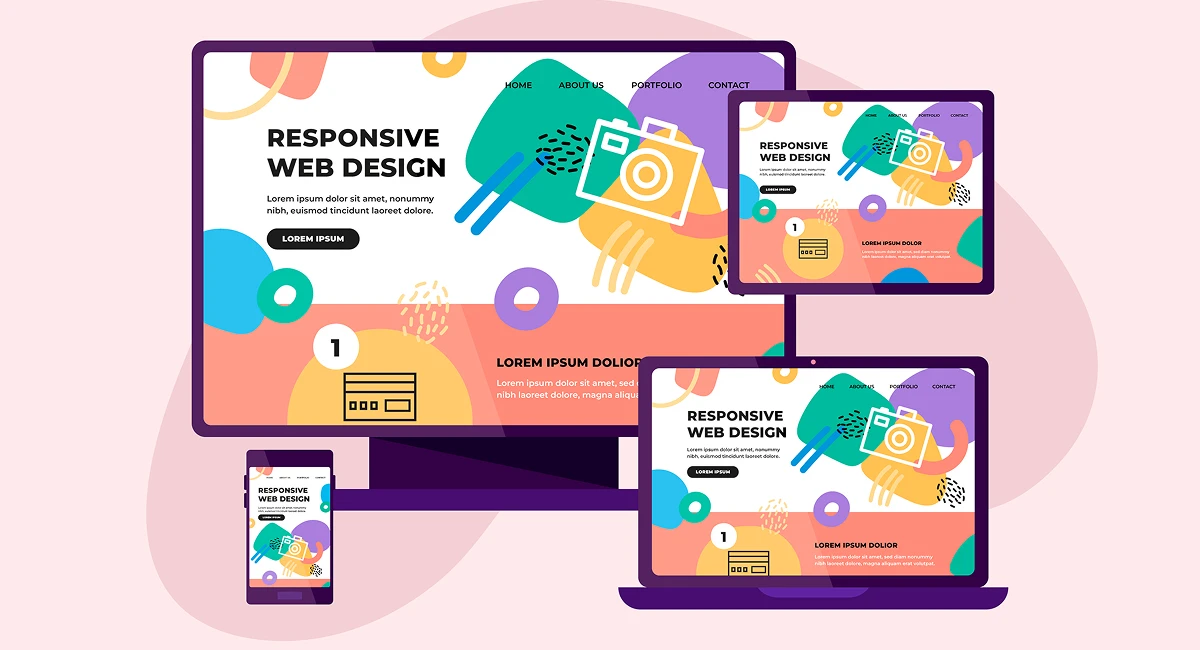
In today's digital world, users expect seamless experiences no matter what device they’re using — whether it's a desktop, tablet, or smartphone. This is where responsive web design steps in. It ensures that websites adapt gracefully to varying screen sizes and resolutions, offering users a consistent, optimized experience regardless of the device they use.
Responsive design isn't just about aesthetics — it's about functionality, accessibility, and user satisfaction. With the explosion of mobile internet usage, it's no longer enough to build for desktop first. A website that isn’t responsive risks losing visitors, hurting engagement, and even dropping in search engine rankings. Google and other search engines now prioritize mobile-friendly websites, making responsive design a critical factor in modern SEO strategies.
At its core, responsive design is all about flexibility. It uses a combination of fluid grids, flexible images, and media queries to ensure that content adjusts seamlessly across different screen sizes. Rather than creating separate designs for mobile, tablet, and desktop, developers now aim for one dynamic layout that can scale up or down as needed.
Moreover, a responsive site ensures that navigation is intuitive, text remains readable, and images load correctly, which significantly boosts user retention and trust. Whether someone’s browsing on a phone during their morning commute or checking a site on a large monitor at work, the experience should be smooth and consistent.
In this blog, we’ll break down the core principles of responsive design, walk through practical implementation techniques, and explore how it benefits your site's performance and visibility in search engines. By the end, you'll have a comprehensive understanding of how to create websites that not only look good — but work flawlessly on any device.
Designing for multiple devices isn’t just a trend — it’s a necessity. To achieve a fully responsive website, developers rely on a set of foundational principles that ensure flexibility and consistency across devices. Here’s a deep dive into the core building blocks of responsive design.
Traditionally, web layouts used fixed pixel widths, which caused problems when viewed on different screen sizes. Fluid grid layouts solve this by using relative units like percentages instead of fixed pixels. This allows the layout to adapt proportionally to any screen size.
Imagine a three-column layout on a desktop. On a mobile screen, those same columns might stack vertically, each occupying 100% of the screen width instead of 33%. This fluidity ensures that users can access all the content comfortably, regardless of their device.
Implementing a fluid grid usually starts with a well-structured CSS framework or custom layout system. Developers define containers, rows, and columns that expand and contract based on the viewport width. It's the backbone of responsive structure.
Images that are too large or improperly scaled can break a responsive layout. That’s why flexible media is key. By applying CSS properties like max-width: 100% and height: auto, images automatically resize to fit their container, preventing them from overflowing or distorting.
Beyond simple images, media includes embedded videos, charts, and interactive elements. Using responsive embed techniques — like aspect ratio containers — helps maintain proper formatting across all screens.
This also plays into performance. Responsive images (using the srcset attribute) allow browsers to load the most appropriate image size based on screen resolution, which speeds up load time and improves UX.
Perhaps the most powerful tool in responsive design is the CSS media query. Media queries let developers apply different styles based on device characteristics — such as width, height, orientation, and resolution.
For example:
@media (max-width: 768px) { .nav-menu { display: none; } }This simple rule hides the navigation menu on smaller devices, allowing for a cleaner, mobile-friendly interface. Developers commonly define breakpoints at widths like 320px (mobile), 768px (tablet), and 1024px (desktop), tailoring the design at each stage.
Media queries bring precision and control to responsive design, ensuring the layout responds intelligently to users' environments.
These three principles — fluid grids, flexible media, and media queries — work together to create web experiences that are intuitive, accessible, and effective across all platforms. Mastering them sets the foundation for successful responsive websites.
Now that we’ve covered the foundational principles, let’s explore how to put them into action. Implementation involves choosing the right design approach, testing across devices, and optimizing for performance, accessibility, and SEO — all of which are essential for delivering a polished, user-friendly website.
When starting a responsive project, one of the first decisions is choosing between a mobile-first or desktop-first design strategy.
Mobile-first means designing for the smallest screen first and progressively enhancing for larger devices. This approach encourages simplicity, performance, and prioritizing essential content. It’s also closely aligned with Google’s mobile-first indexing, giving it an edge for SEO.
/* Base mobile styles */ body { font-size: 16px; } /* Larger screens */ @media (min-width: 768px) { body { font-size: 18px; } }On the other hand, desktop-first starts with a full-size layout and scales down for smaller devices. While this may seem easier, it can lead to performance issues or content overload on mobile if not handled carefully.
In most modern projects, mobile-first is considered the best practice — but it depends on your target audience and business goals.
A website might look great in your browser, but how does it perform on a low-resolution Android phone or a high-DPI iPad? Thorough testing is critical to ensuring a seamless experience across real-world conditions.
Here are some top tools and strategies:
Browser DevTools: Chrome, Firefox, and Safari include device simulation modes.
Online Testing Platforms: Tools like BrowserStack and LambdaTest offer real-device cloud testing.
Manual Testing: Physically testing on actual phones and tablets is invaluable.
Automated Audits: Use tools like Google Lighthouse to evaluate performance, accessibility, and responsiveness.
Testing should cover various breakpoints, input methods (touch vs mouse), and performance on slower networks to catch real-world issues before users do.
Responsive design is about more than screen size — it’s about how well your site performs and includes everyone.
Performance: Use responsive image formats (like WebP), lazy loading, and minimize unnecessary scripts to reduce page weight and improve loading times — especially on mobile.
Accessibility: Ensure buttons are large enough for touch input, font sizes are legible, and contrast is sufficient. Use semantic HTML and ARIA attributes for screen readers.
SEO: Google favors mobile-friendly websites. Responsive design ensures your site passes mobile usability checks, reduces bounce rates, and enhances indexing across devices.
A well-optimized responsive site doesn’t just look good — it works efficiently and serves a broader audience with fewer barriers.
When implemented thoughtfully, responsive design ensures that users enjoy a consistent, intuitive, and performant experience — whether they’re on a smartphone at the beach or a desktop at work. And with the right optimization, your site can reach more users, rank higher, and perform better than ever.
Responsive design is no longer a luxury — it’s a necessity. With users accessing the internet from an ever-expanding range of devices, building websites that adapt seamlessly to every screen size is a foundational skill for modern web developers and designers.
Throughout this blog, we’ve explored the key principles of responsive design — from fluid grids and flexible media to the powerful use of CSS media queries. We’ve also looked at practical implementation strategies, including mobile-first development, robust testing methods, and critical optimizations for performance, accessibility, and SEO.
But responsive design isn’t just about coding or layout. It’s about understanding user needs, anticipating how people interact with your content across different contexts, and delivering an experience that feels natural no matter the device. It’s about crafting digital spaces that respect users' time, preferences, and attention.
By embracing responsive design, you’re not just improving usability — you're future-proofing your site. You’re positioning your content to reach wider audiences, perform better in search rankings, and create a stronger connection with visitors who appreciate speed, clarity, and accessibility.
If you’re a developer, designer, business owner, or content creator, now is the time to prioritize responsiveness in every digital project. Start small: review your current website on multiple devices, experiment with flexible layouts, and use testing tools to identify areas for improvement.
The web is dynamic and user expectations are higher than ever. But with the right approach to responsive design, your site can rise to meet them — delivering experiences that are smooth, intuitive, and impactful across every screen.
No bio available yet.
WordPress 7.0 marks one of the platform’s most talked-about updates, mainly because of its bui
22 May 2026
The future of web design is moving far beyond attractive layouts and modern colors. Today, a good we
4 May 2026
In today’s fast-paced digital world, a visually appealing website is no longer enough. If your
19 January 2026
Be the first to share your thoughts
No comments yet. Be the first to comment!
Share your thoughts and join the discussion below.


.webp&w=3840&q=75)


