* All product/brand names, logos, and trademarks are property of their respective owners.
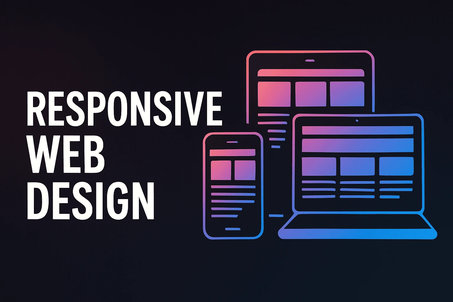
The way we browse the web has changed. With smartphones, tablets, laptops, and desktops all in use, websites must work seamlessly across every screen size. That’s where responsive web design comes in.
Responsive web design is the practice of building websites that adjust automatically to fit any device. In 2025, it’s no longer optional—it's essential. Users expect fast, clean, mobile-friendly experiences, and search engines reward websites that deliver them.
This guide is designed for beginners. You’ll learn what responsive design is, why it matters today more than ever, and how to start implementing it. From layout basics to modern tools, we’ll walk you through the key principles step by step.
Let’s dive into how you can build smart, flexible websites that look great everywhere.
Let’s explore the foundational concepts that make a website truly responsive. These principles ensure that your site looks and functions well across all devices—from small smartphones to large desktop monitors.
Traditional web design often used fixed-width layouts, meaning the website stayed the same size no matter what screen it appeared on. This approach simply doesn’t work in 2025, when screen sizes vary so widely.
Fluid grids solve this by using relative units like percentages instead of fixed pixels. For example, instead of setting a column to be 300px wide, you might set it to take up 30% of the screen. This allows the layout to stretch or shrink depending on the device.
Flexible layouts build on this concept, allowing elements like text blocks, images, and columns to resize and reposition automatically. It makes for a smoother, more consistent user experience no matter how people access your site.
Media queries are CSS rules that apply styles based on the size or features of the device being used. For instance, you might want larger fonts and fewer columns on a smartphone than on a desktop. Media queries make this possible.
A breakpoint is the screen width at which your site’s layout changes to better suit the device. Common breakpoints include 480px (phones), 768px (tablets), and 1024px (desktops), but you can set custom values based on your audience’s needs.
By using media queries and breakpoints, you can tailor your design to offer an optimal experience on every screen size.
The mobile-first approach flips the traditional design process. Instead of starting with the desktop layout and scaling down, you start with the smallest screen first and build upward.
Why is this important? Because mobile usage dominates the web, and designing for mobile from the beginning ensures your site stays lightweight, fast, and focused on essential content. It also aligns with how Google indexes and ranks websites—mobile-first indexing means the mobile version is now the primary version for SEO.
With the basics of responsive design under your belt, let’s dive into the practical side: what tools to use and how to apply smart strategies to build future-ready, user-friendly websites.
In 2025, developers have access to a variety of tools that make responsive web design faster and more efficient:
Tailwind CSS: A utility-first CSS framework that lets you design directly in your HTML using pre-built responsive classes.
Bootstrap 5: Still widely used, it offers a responsive grid system and ready-made UI components that save development time.
Figma & Adobe XD: These design tools let you create and test responsive layouts visually before writing any code.
AI-based design assistants: New tools like Wix ADI or Framer AI are helping even non-coders create responsive sites through smart automation.
Choose the tools that fit your workflow, but always test your designs on multiple devices and screen sizes to ensure real-world responsiveness.
Even with the best tools, it’s easy to slip up. Here are some pitfalls to watch out for:
Using fixed widths: Stick to percentages and flexible units for layout elements.
Ignoring content hierarchy: On smaller screens, your most important content should appear first.
Forgetting touch optimization: Buttons and links should be large enough to tap comfortably.
Not testing across devices: What looks good on your laptop might break on a phone.
Being aware of these common issues can help you design smoother, more accessible websites from the start.
Responsive design isn’t just about looks—it’s about performance too. Here’s how to make your site faster and more effective:
Speed: Use responsive images (like srcset) to load appropriately sized images. Compress files and use lazy loading where possible.
SEO: A responsive site with mobile-first design helps improve search rankings. Avoid duplicate content issues by using a single, adaptive site instead of separate mobile and desktop versions.
Accessibility: Make sure your site is usable by everyone, including people with disabilities. Use clear contrast, readable fonts, alt text for images, and semantic HTML.
Focusing on these areas not only improves user experience but also boosts your site's visibility and credibility.
Responsive web design has evolved from a nice-to-have into an absolute must in 2025. With users browsing on everything from foldable smartphones to ultra-wide monitors, websites need to be flexible, fast, and user-friendly across the board.
In this guide, we covered the core principles—fluid grids, media queries, and mobile-first strategies—that form the foundation of any responsive site. We also explored modern tools like Tailwind CSS and Bootstrap 5, discussed common beginner mistakes, and shared tips for optimizing your site’s speed, SEO, and accessibility.
If you’re just starting out, remember: you don’t need to be a coding expert to build a responsive website. What matters most is understanding how users interact with your content across devices—and designing with that in mind. Test your site often, use tools that simplify the process, and always keep the user experience at the heart of your decisions.
By mastering responsive design, you're not just building better websites—you’re creating digital experiences that are inclusive, accessible, and ready for the future.
Ready to start your first responsive project? Explore beginner-friendly platforms, play with layout tools, and don’t be afraid to experiment. The web is constantly evolving—and with responsive design, you’ll be ready for whatever comes next.
No bio available yet.
WordPress 7.0 marks one of the platform’s most talked-about updates, mainly because of its bui
22 May 2026
The future of web design is moving far beyond attractive layouts and modern colors. Today, a good we
4 May 2026
In today’s fast-paced digital world, a visually appealing website is no longer enough. If your
19 January 2026
Be the first to share your thoughts
No comments yet. Be the first to comment!
Share your thoughts and join the discussion below.


.webp&w=3840&q=75)


