* All product/brand names, logos, and trademarks are property of their respective owners.
In today's mobile-first world, how users interact with their screens isn't just a matter of design—it's a core part of the user experience. We've all been there: tapping the wrong button, accidentally triggering the wrong link, or having to tap multiple times just to get a response. These small frustrations might seem minor, but they can quickly add up and lead to one thing—users leaving your app or website.
This is where the concept of mobile tap targets UX becomes crucial. Touch zones and tappable areas in mobile design aren’t just about size—they’re about usability, accessibility, and making interaction seamless for fingers of all sizes. When done right, tap targets feel natural and easy. When done wrong, they can frustrate users, increase bounce rates, and even damage your brand’s credibility.
Think about it: fingers aren’t as precise as mouse pointers. Unlike desktop interfaces, mobile UX has to consider thumbs, one-handed use, and varying screen sizes. Whether it’s a call-to-action button, a navigation link, or an image meant to be tapped, every touchpoint must be thoughtfully designed.
This blog dives deep into touch zones mobile design, breaking down best practices, proven standards, and modern techniques that ensure your tappable areas are truly user-friendly. We’ll cover essential guidelines from Apple and Google, look at real-world examples, and even explore next-level concepts like rage tap analytics and tap prediction models.
If you want to create tappable areas that don’t just work—but work effortlessly—stick around. Let’s make mobile UX that your users won’t even have to think about.
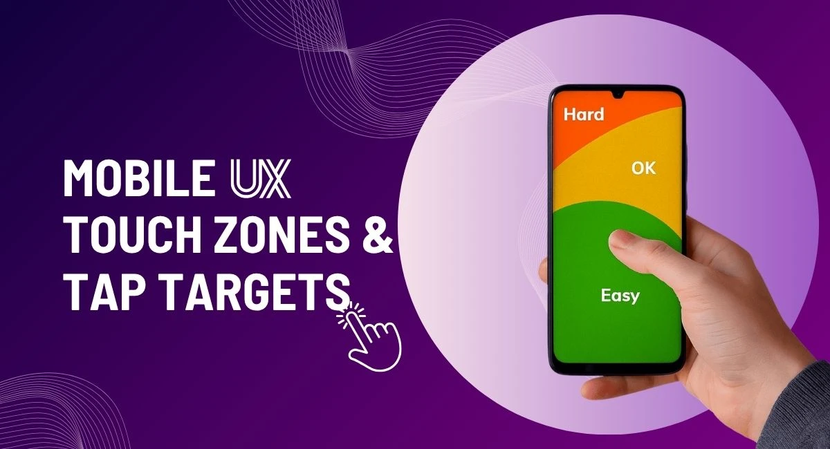
When it comes to creating intuitive mobile experiences, size really does matter—especially for tap targets. Both Apple and Google provide clear guidelines on what constitutes a “safe” size for tappable elements. According to Apple’s Human Interface Guidelines, the minimum recommended size for a tap target is 44×44 pixels. Google’s Material Design slightly increases that to 48×48 density-independent pixels (dp).
Why the difference? It’s all about usability and ensuring that users can interact comfortably without precision tools like a stylus. The goal is simple: minimize errors and ensure users can tap what they intend to on the first try. These standards are grounded in research around finger size and touch accuracy.
By designing within these dimensions, you're creating tap targets that feel naturally responsive and user-friendly, regardless of screen size. It’s a key principle in mobile tap targets UX that every designer should apply from the get-go.
Spacing is just as important as size. Even perfectly sized buttons can cause frustration if they’re placed too closely together. That’s why UX experts recommend at least 8px of space between interactive elements. This buffer prevents users from accidentally tapping the wrong item, which is especially common when people are walking, multitasking, or using one hand.
Good touch zone spacing isn’t just about comfort—it’s about reducing mis-taps and making your interface forgiving. Think of it as breathing room for your UI. When done right, users barely notice the space; they just experience smooth, error-free interactions.
Most users operate their phones with one hand. This has led to the concept of the “thumb zone”—areas of the screen that are easiest to reach with a thumb. UX designers map these zones and place key actions (like navigation and primary buttons) within them to ensure quick, comfortable access.
Ignoring the thumb zone leads to strained gestures, increased drop-offs, and poor UX. Embracing it means your app or site feels easier to use—without users even knowing why.
Tapping isn’t just a mechanical action—it’s an interaction. And like any good conversation, it needs a response. That’s where feedback comes in. One of the most overlooked elements in touch zones mobile design is how the interface reacts to taps. Whether it’s a subtle ripple effect, a color change, or a micro animation, feedback assures the user that their action was received.
The ideal response time? Under 100 milliseconds. Any longer, and it might feel like a lag or glitch. In apps like Google Maps or YouTube, you’ll notice that buttons and icons react almost instantly—this isn't accidental. It's engineered to make users feel in control.
Incorporating visual and tactile feedback improves tappability and builds trust. It’s a small detail that makes a huge difference in mobile UX.
Ever tap something repeatedly because it just doesn’t respond the way you expect? That’s called a rage tap—and it’s a key indicator of bad mobile UX. Analytics tools like FullStory or Hotjar now track these behaviors to identify weak spots in tappable areas.
These patterns reveal frustration hotspots—maybe a button is too small, too close to another, or lacks proper feedback. By identifying where users are rage tapping, you can make data-driven decisions to improve design. It's not just about guessing; it’s about watching and optimizing based on real user behavior.
Making tappable areas mobile-friendly isn’t just design—it’s analysis, iteration, and empathy.
Modern UX is evolving beyond static layouts. Tools like the Tappy model now use AI to predict whether a tap will be successful based on design elements like size, position, and context. This kind of predictive UX can help designers pre-empt problems before they even go live.
Another innovative approach? Tap tips—small, unobtrusive hints that guide users toward interactive elements. Think of the little tooltips that appear when you hover or the brief glow around a tappable area during onboarding. These touches increase engagement and help users learn faster.
By integrating prediction and guidance, you're building mobile interfaces that are not only user-friendly but also future-ready.
Creating a seamless mobile user experience isn’t just about making things look pretty—it’s about designing with the finger in mind. From ensuring your tap targets are sized correctly to optimizing spacing and understanding thumb zones, every decision you make impacts how users interact with your product.
We’ve explored the foundational best practices: minimum size standards, spacing guidelines, and ergonomic placement. Then we took it further with smart UX strategies—like providing immediate feedback, tracking rage taps, and experimenting with predictive tap models and tap tips. All of these contribute to a mobile interface that feels intuitive, reliable, and easy to use.
In short, mobile tap targets UX is where functionality meets empathy. You’re not just building interfaces—you’re building trust through every tap.
No bio available yet.
Accessibility and conversion are often treated like separate goals. In reality, many accessibility i
5 June 2026
WordPress 7.0 marks one of the platform’s most talked-about updates, mainly because of its bui
22 May 2026
The future of web design is moving far beyond attractive layouts and modern colors. Today, a good we
4 May 2026
Be the first to share your thoughts
No comments yet. Be the first to comment!
Share your thoughts and join the discussion below.


