* All product/brand names, logos, and trademarks are property of their respective owners.
Design isn't just about making things look pretty it's about making them work beautifully for people. When it comes to digital interfaces, the choice between flat design and skeuomorphic design has been a hot topic in the design world for over a decade. These two design philosophies approach user experience (UX) from very different perspectives, and choosing the right one can make or break how users interact with a product.
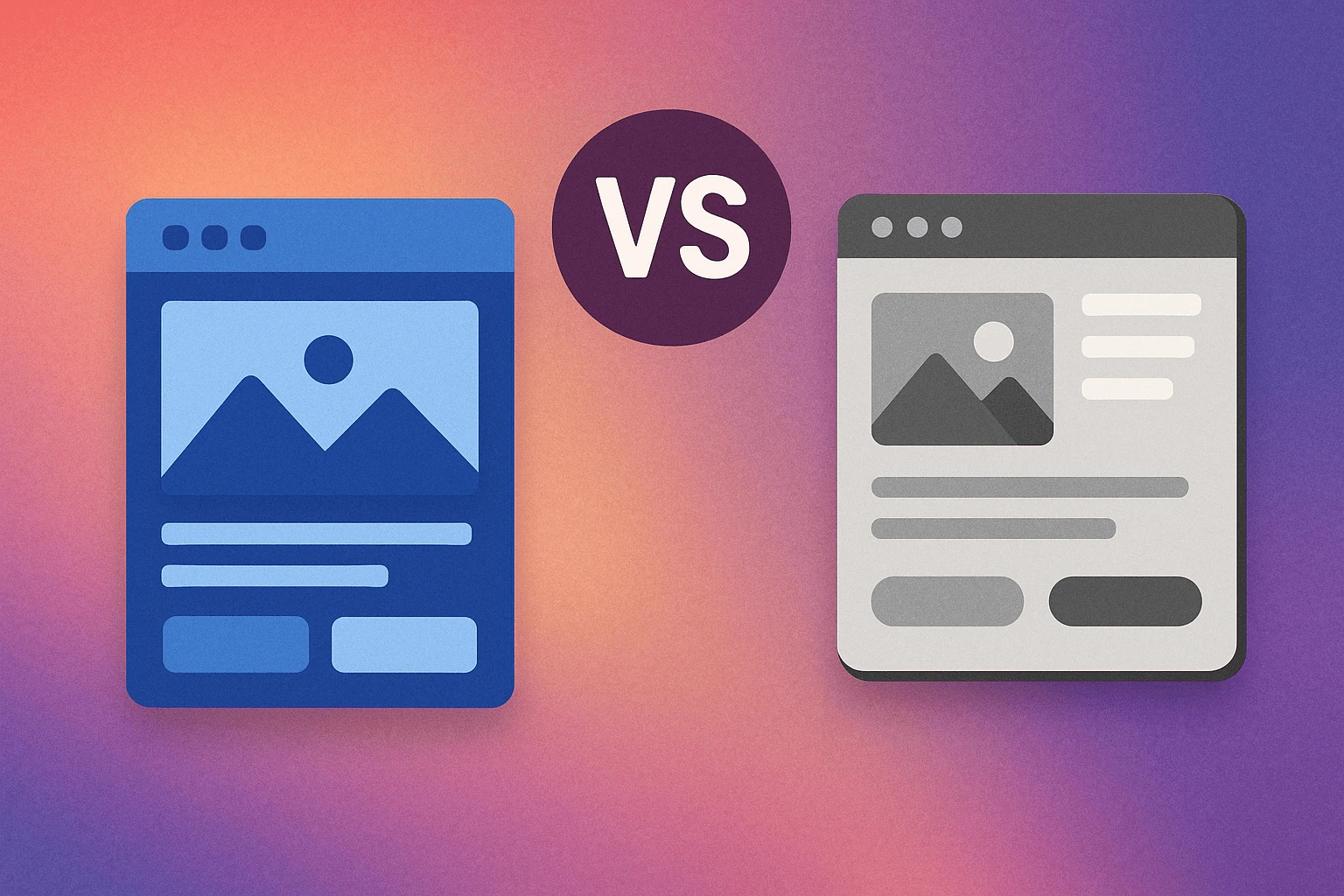
On one side, skeuomorphic design mimics real-world objects think calculator apps with buttons that look like physical ones or note-taking apps designed like spiral-bound notebooks. This style was dominant in the early days of smartphones because it helped users relate to digital tools through familiar visual metaphors.
On the other hand, flat design emerged as a response to the visual clutter of skeuomorphism. It's sleek, minimal, and modern. It removes unnecessary textures, shadows, and gradients in favor of simplicity and function. This shift wasn’t just aesthetic it aligned with faster web performance, responsive design, and an increasingly tech-savvy global audience.
So, which is better for user experience the realism of skeuomorphism or the clarity of flat design? Or is the real answer somewhere in between, like Material Design or Neumorphism hybrids that aim to balance aesthetics with usability?
In this blog, we’ll explore the history, pros and cons, usability studies, and modern applications of both design styles. Whether you’re a UX designer, a developer, or someone building a product, understanding this debate will help you make smarter design decisions.
Let’s break down what makes each style shine and when it might be smart to mix them.
Skeuomorphic design is all about familiarity. It replicates the appearance and functionality of real-world objects in digital interfaces to help users understand how to interact with them. For example, early versions of Apple's iOS featured a notes app that looked like a physical notepad and a bookshelf-style interface for iBooks. These visuals weren’t just decorative they were functional metaphors meant to guide users who were new to touchscreen interfaces.
This approach stems from the idea that mimicking physical objects can improve usability, especially when users are unfamiliar with digital systems. In the early 2000s, when smartphones were emerging, skeuomorphism provided a comforting bridge between the analog and digital worlds. It helped users intuitively understand what buttons to press and how to interact with digital tools by relying on visual memory from real life.
As users became more digitally fluent, the need for overly realistic visuals began to fade. In response, flat design emerged — emphasizing minimalism, geometric shapes, bold colors, and the absence of gradients and shadows. Microsoft championed this aesthetic with its Metro UI, followed by Apple’s flat rebranding in iOS 7, and Google’s development of Material Design, which refined the flat design style with a touch of realism through layered elements and motion.
Flat design gained momentum because it aligned with modern web needs faster load times, responsive layouts, and a cleaner user interface across screen sizes. It was easier to scale across devices and reduced the visual noise, making apps feel modern and efficient.
The shift from skeuomorphism to flat design wasn’t just a stylistic choice it was a response to how people interact with technology. As global users became comfortable with smartphones, tablets, and apps, they no longer needed skeuomorphic cues to understand functionality. The rise of touch interfaces, gesture-based navigation, and voice assistants also contributed to the move toward visual simplicity.
Moreover, faster internet speeds, high-resolution displays, and the growing importance of accessibility pushed designers toward streamlined visuals that are easy to interpret, quick to load, and universally adaptable. Flat design became the global design language for digital-first products, setting the foundation for modern UX.
Usability is at the heart of every design decision. Skeuomorphic design was initially hailed for its intuitive appeal it mirrors real-world objects, making it easy for users (especially beginners) to understand interface elements. A trash can icon for deleting files, a rotary dial for old phone apps these metaphors guide the user without the need for explanations.
But while skeuomorphism scores high on learnability for new users, it often introduces unnecessary visual noise. Realistic textures, excessive shadows, and detailed graphics can clutter the interface, especially on mobile screens.
Flat design, in contrast, removes distractions. With its clean and minimalist approach, users focus directly on functionality. However, this can sometimes come at the cost of discoverability. Flat buttons may not always look like buttons, which can confuse users, particularly in apps with complex features.
Verdict: Skeuomorphism is great for onboarding and familiarity. Flat design excels in clarity and task efficiency — especially for experienced users.
Aesthetics are subjective, but trends often dictate what users perceive as "modern." Flat design wins in this category it's visually clean, trendy, and aligns with modern branding. From mobile apps to SaaS platforms, companies prefer flat or semi-flat designs for their sleek look and universal appeal.
Skeuomorphic design, while rich in detail and texture, can feel outdated if not done tastefully. However, when used in the right context like gaming, educational tools, or creative apps it can deliver a more engaging and immersive experience.
The key lies in execution. Overdone skeuomorphism can feel tacky. Poorly implemented flat design can feel sterile.
Performance is a crucial factor in modern UX. Flat design offers clear advantages here. Its minimalistic elements mean fewer assets to load, smoother rendering across devices, and better responsiveness all of which are essential for global users on varied internet speeds and devices.
Skeuomorphic interfaces, with their high-fidelity graphics, gradients, and textures, can increase load times and impact performance, especially on low-end devices. For mobile-first design and global scalability, flat design remains the more efficient choice.
However, advances in web technology (e.g., SVG, WebP, hardware acceleration) are narrowing the performance gap making rich visuals more feasible than before.
Flat design is an excellent choice when speed, clarity, and scalability are critical. It’s especially effective for:
Enterprise dashboards: Users need to process large amounts of information quickly. A flat UI reduces cognitive overload and supports a clean data hierarchy.
SaaS applications: With users accessing platforms across devices, flat design ensures consistency and responsiveness, enhancing user experience on both desktop and mobile.
Mobile-first products: Flat elements load faster and adapt more fluidly to small screens. Simpler graphics mean better performance and improved UX in low-bandwidth regions.
Flat design also aligns with modern branding trends it gives products a clean, tech-forward image. But designers must still consider affordance (how an element shows its function). Flat buttons should still feel clickable, using hover effects, shadows, or micro-animations to guide users.
Skeuomorphism shines in situations where real-world familiarity improves learning or engagement:
Educational tools: For younger audiences or tech beginners, skeuomorphic interfaces help bridge the gap between digital and physical concepts. Think of music learning apps that mimic piano keys or drawing apps that simulate real brushes.
Gamified experiences: Game interfaces often benefit from rich, tactile feedback skeuomorphic elements add visual storytelling and immersion.
Creative applications: Apps for art, design, or multimedia creation often incorporate realistic textures and controls to make the experience more intuitive.
In these contexts, a skeuomorphic interface can provide visual cues that reduce the learning curve, making complex features more approachable.
The future isn’t about choosing sides it’s about blending strengths. Enter hybrid design systems:
Material Design (Google): Combines flat aesthetics with subtle shadows, motion, and hierarchy for better usability.
Flat Design 2.0: A semi-flat approach that reintroduces light depth cues for affordance, without the visual weight of skeuomorphism.
Neumorphism: A newer style that uses soft shadows and gradients to create UI elements that look semi-3D — elegant but best used sparingly due to accessibility concerns.
These hybrid approaches offer designers a middle ground clean interfaces with enough depth to guide users effectively.
As we step into immersive technologies like Augmented Reality (AR) and Virtual Reality (VR), skeuomorphism is making a quiet but meaningful comeback. Why? Because when users interact with 3D environments or virtual objects, realistic design cues are essential for intuitive interaction.
In AR/VR, interfaces must simulate depth, shadow, and physical affordance to guide user behavior a concept core to skeuomorphic design. Virtual buttons, switches, and objects need to behave like their real-world counterparts to feel natural.
Meta (formerly Facebook), Apple’s Vision Pro, and other immersive tech platforms are pushing this trend. Their UIs rely heavily on spatial understanding, and skeuomorphic visual logic fits perfectly in this context.
As immersive tech becomes more mainstream, we may see a revival of realistic design not as a visual gimmick, but as a UX necessity.
At the same time, UI is moving beyond screens. With the rise of voice UIs, gesture control, and ambient computing, visual design is becoming more context-aware and minimal.
Smart assistants like Alexa, Siri, and Google Assistant reduce the need for visual elements entirely. In these systems, design must support multimodal interaction voice, touch, and environment awareness.
Flat design, in its minimalism, aligns well with these shifts. But it’s not about flat vs. skeuomorphic anymore it’s about how visual design supports user intent in fluid, screenless environments.
Designers are now challenged to think beyond pixels. How does a design guide a gesture? How does a tone of voice create trust? How do you design feedback without a visual interface?
The future of UI design won’t be one-size-fits-all. We’re moving toward adaptive UIs that change based on user behavior, device context, and even emotional cues. A productivity app might default to flat design in a work context, but shift to a skeuomorphic skin in a creative mode all based on usage data.
This contextual adaptability demands flexible design systems ones that borrow from both philosophies, adapting visual elements to optimize user experience in real time.
The debate between flat design and skeuomorphic design isn’t about picking a winner it’s about understanding context, purpose, and the user experience you're trying to create.
Skeuomorphism gave early users a sense of familiarity in a then-new digital world. It helped people transition from physical to digital by mimicking real-world objects. But as users became more tech-savvy, the cluttered aesthetics and heavy interfaces gave way to the clean, modern minimalism of flat design.
Flat design brought performance, simplicity, and responsiveness to the forefront — essentials in today’s global, mobile-first world. Yet, it sometimes lacks visual affordance, especially for users who rely on intuitive cues.
What we’re seeing today is not a strict divide but a blending of styles. Design systems like Material Design and Neumorphism show us that the best user experiences often lie in thoughtful combinations. Flat design’s simplicity with skeuomorphism’s clarity can coexist — and should, when needed.
Ultimately, great UI isn’t about the trend you follow; it’s about knowing your audience, your product’s purpose, and the environment it lives in. Whether you go flat, realistic, or somewhere in between, your design should serve the user always.
💬 What do you think? Do you prefer the sleekness of flat interfaces or the realism of skeuomorphic ones? Drop your thoughts in the comments — we’d love to hear from designers, developers, and everyday users alike!
No bio available yet.
Accessibility and conversion are often treated like separate goals. In reality, many accessibility i
5 June 2026
UI/UX Design in 2026 is not just evolving. It is shifting at a pace that feels hard to ignore. New t
21 April 2026
Have you ever opened an app and instantly felt confused? Maybe you couldn’t find the button yo
8 April 2026
Be the first to share your thoughts
No comments yet. Be the first to comment!
Share your thoughts and join the discussion below.


