* All product/brand names, logos, and trademarks are property of their respective owners.
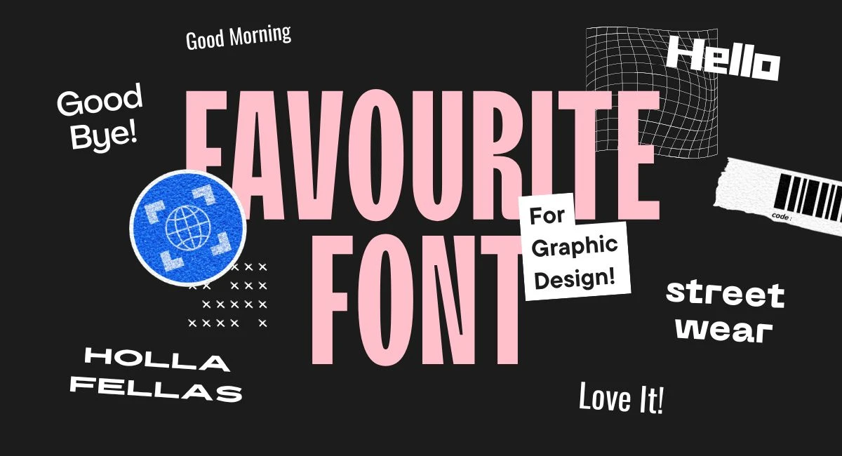
In the fast-moving world of design, staying updated with the latest trends is more important than ever — and typography is no exception. Whether you’re creating logos, websites, social media graphics, or packaging, the right font can completely transform the look and feel of your work.
As we move into 2025, designers everywhere are on the hunt for fonts that are not only visually appealing but also functional, versatile, and — if possible — completely free. And thankfully, there’s a treasure trove of high-quality, free fonts available that match the quality of paid options, if not exceed them in creativity.
This year, we’re seeing some clear favorites emerging among creatives. From sleek modern sans-serifs to expressive display fonts, the font trends of 2025 are about bold personality, high readability, and flexible use across both digital and print formats.
But here’s the catch: with thousands of free fonts floating around online, finding the right ones can be overwhelming. That’s why we’ve done the legwork for you. We’ve curated a fresh list of 25 free fonts designers are loving in 2025, based on trends, usability, and real-world designer feedback.
You’ll find fonts perfect for branding projects, website headlines, social media graphics, and everything in between. We’ve even organized them by style to help you easily find what fits your next project — whether you’re after something classy, minimal, funky, or just different.
And we won’t stop at just names and previews. We’ll also give you download links, usage tips, and expert advice on how to get the most out of these fonts in your own designs.
Serif fonts in 2025 are all about mixing timeless elegance with a fresh, updated vibe. Designers are using these fonts to bring a touch of sophistication to websites, packaging, and print designs.
1. Cormorant Garamond
Classic yet refined, this font shines in luxury branding and editorial layouts. Its sharp contrast and traditional structure give it an elegant presence.
2. Playfair Display
This high-contrast serif is perfect for fashion-forward designs and magazine-style headers. Its flowing strokes add a sense of grace and style.
3. Lora
A balanced serif that feels organic and warm. Lora works beautifully in long-form content, combining readability with a hint of personality.
4. Alegreya
Designed for comfort while reading, this dynamic serif font adds rhythm and movement to paragraphs. Ideal for storytelling and content-heavy designs.
5. Fraunces
With a retro flair and variable weight options, Fraunces is a favorite for designers looking to add vintage charm with modern control.
Sans-serif fonts remain essential for clean, modern design. In 2025, the best ones combine sleek geometry with bold versatility, perfect for digital use and branding alike.
6. Inter
A modern, readable sans with strong performance on screens. Inter is a staple in UI/UX design and tech-focused branding.
7. Manrope
Minimalist and structured, Manrope fits perfectly in futuristic designs, portfolios, and brands seeking a polished edge.
8. Satoshi
Clean, contemporary, and highly legible, Satoshi is making waves in startup culture and SaaS platforms.
9. Poppins
Rounded and friendly, Poppins brings an approachable tone to web projects and lifestyle branding.
10. Outfit
Streamlined and stylish, Outfit is rising in popularity for brands embracing minimalist aesthetics and visual clarity.
Display fonts are about grabbing attention — and the most popular ones in 2025 do it with flair, boldness, and originality. These are perfect for large headings, posters, and standout identities.
11. Bebas Neue
Bold, tall, and commanding — a perfect choice for modern headlines, posters, and social media content.
12. Gloock
Mixing vintage serif structure with high fashion styling, Gloock gives designs a strong, elegant tone.
13. Founders Grotesk (Trial)
A beloved font among professionals, this sleek grotesque typeface makes an impact in contemporary branding.
14. Raleway Dots
Whimsical and futuristic, this dotted version of the classic Raleway adds personality to creative or experimental designs.
15. Bluu Next
With its sharp edges and dramatic presence, Bluu Next is ideal for projects that demand character and visual drama.
Typography is more than just picking a pretty font — it’s about making thoughtful decisions that enhance your design’s message, tone, and usability. In 2025, as visual trends evolve and audience expectations shift, understanding how to choose and use fonts strategically is more crucial than ever.
Pairing fonts well can elevate your design from ordinary to unforgettable. The secret lies in balance and contrast.
Start by choosing a primary font that reflects your brand or project tone — this is usually your headline or display font. Then, pair it with a complementary body font that enhances readability. For instance, a bold, modern sans-serif like Manrope can pair beautifully with a softer serif like Lora.
Avoid using fonts that are too similar, as this can look unintentional or flat. Instead, aim for combinations that contrast in weight, style, or classification (serif + sans-serif, bold + light, wide + narrow).
And remember: less is more. Stick to two fonts (three max) across a single design to maintain consistency and harmony.
In 2025, designers are striving to strike the perfect balance between visual impact and practical readability.
While decorative or display fonts can grab attention, they’re often best reserved for short headlines or callouts. For longer texts — such as blog content, product descriptions, or app interfaces — readability should always take priority.
Consider factors like letter spacing, line height, and font weight. Even the most stylish font can become a design liability if it's hard to read.
Modern typefaces like Inter and Outfit are popular not just for their looks, but for how smoothly they render on screens — especially in responsive designs. They prove that functional can still be beautiful.
Not all “free” fonts are created equal. As a designer, using properly licensed fonts is essential to avoid copyright issues — especially for commercial work.
In 2025, the most trusted sources for free, high-quality fonts include:
Google Fonts – Wide selection, free for both personal and commercial use
Fontshare – Offers fresh, modern typefaces with clear licensing
Velvetyne Type Foundry – Creative, unique fonts often available under open licenses
The League of Moveable Type – Well-crafted, open-source fonts made by type lovers
DaFont (with caution) – Always double-check the usage license before using
Always read the licensing terms — even for free fonts. Some are free only for personal use, while others allow full commercial use. When in doubt, reach out to the designer or source for clarification.
Typography isn’t just a design element — it’s a powerful storytelling tool. The fonts you choose can influence how people perceive your work, how they engage with your content, and even how they remember your brand.
In this guide, we’ve explored 25 of the best free fonts designers are loving in 2025, each one offering a unique voice and purpose. From modern serifs that add a touch of class, to clean sans-serifs built for digital clarity, to bold display fonts that make statements — this collection covers a wide range of styles for every type of creative project.
We also dove into expert tips for pairing fonts, keeping readability top-of-mind, and ensuring you’re sourcing your fonts from safe, legal platforms. These insights can make a real difference in the quality and impact of your designs.
Now it’s your turn. Whether you’re designing a new brand, building a website, or just looking to freshen up your font library, this curated selection is a great place to start. Don’t be afraid to mix, test, and explore these fonts in different contexts — sometimes, the most unexpected pairings lead to the most brilliant results.
So go ahead — experiment, have fun, and let your typography do the talking.
No bio available yet.
Every creator knows the feeling: you want to make something fresh, but your ideas feel stuck. You sc
26 May 2026
Designers are always on the lookout for high-quality assets, but not everyone has the budget to pay
17 April 2026
If you’ve ever worked on a website or app design, you know the feeling. You start with a wiref
24 February 2026
Be the first to share your thoughts
No comments yet. Be the first to comment!
Share your thoughts and join the discussion below.


