* All product/brand names, logos, and trademarks are property of their respective owners.
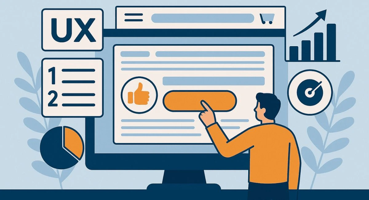
In the fast-paced digital world, a beautiful website alone is no longer enough to win customers. Visitors don’t just judge your brand by its looks — they judge it by how easy it is to use, how quickly it loads, and how confidently it guides them toward making a decision. This is where user experience (UX) becomes a game-changer for website conversions.
Think of your website as a sales representative that works 24/7. If it greets visitors warmly, communicates clearly, and removes all obstacles from their path, it will close more deals. But if it confuses them, makes them wait, or leaves questions unanswered, they’ll walk away — sometimes in just a few seconds. That’s why optimizing for UX isn’t just about design; it’s about creating a smooth, enjoyable journey from the first click to the final purchase.
Studies have shown that a well-designed UX can increase conversion rates by as much as 400%. From small tweaks like improving button placement to major overhauls such as redesigning your checkout process, each UX improvement can have a measurable impact on your bottom line. The best part? Many of these changes are surprisingly simple to implement once you know where to focus.
In this article, we’ll explore seven proven UX principles that will help you transform casual visitors into loyal customers. These principles are backed by both psychology and real-world case studies, ensuring they work across industries and business sizes. Whether you run an eCommerce store, a SaaS platform, or a service-based website, you’ll find actionable insights you can apply today.
Let’s dive in and uncover how these UX strategies can make your website not just look good — but sell more.
Imagine walking into a store where products are scattered randomly and signs point in the wrong direction. Frustrating, right? The same applies to websites. A clear navigation system ensures visitors can find what they need quickly, without having to guess.
Effective navigation means keeping menus simple, labeling pages with familiar terms, and grouping related content logically. Place the main menu where users expect it — usually at the top or side of the page. Avoid overloading it with too many options; instead, focus on the essentials and provide submenus for deeper browsing.
A clean, intuitive layout works hand in hand with navigation. Elements like the search bar, contact information, and key product or service links should be easy to spot. Remember, when users don’t have to think too hard to find something, they’re more likely to stay and convert.
With over 55% of web traffic coming from mobile devices, designing for mobile first is no longer optional — it’s essential. A mobile-first approach means starting your design process with the smallest screen in mind and then scaling up for larger devices.
Responsive design ensures your website automatically adjusts to fit any screen size, offering a seamless experience whether visitors use a phone, tablet, or desktop. This not only improves usability but also supports better SEO rankings, as search engines favor mobile-friendly sites.
Mobile UX best practices include large, tappable buttons, legible font sizes, and avoiding elements that require pinch-zooming. Even small details — like ensuring forms fit perfectly on mobile screens — can significantly boost conversions.
No matter how beautiful or functional your site is, it won’t matter if it takes forever to load. Research shows that 53% of mobile users abandon a site that takes more than three seconds to load.
To improve loading speed, compress images without losing quality, minimize unnecessary scripts, and use a reliable hosting provider. Tools like Google PageSpeed Insights can help identify bottlenecks and offer actionable suggestions.
Faster load times create a smoother user journey and reduce bounce rates, giving you a better chance to engage visitors before they click away. In the world of conversions, every second counts.
Great UX isn’t just about what’s on the page — it’s about how information is presented. Visual hierarchy guides the user’s eye, showing them what’s most important first. This can be achieved through size, color, contrast, and positioning. For example, your most critical call-to-action (CTA) should be bigger, bolder, and placed where users naturally look.
Equally important is white space, or the empty areas around elements. While some see it as wasted space, it’s actually a powerful UX tool. White space helps break up content, making it easier to scan and reducing cognitive load. A clean design feels more premium and encourages users to focus on the key elements that drive conversions.
Your CTA buttons are the bridges between browsing and conversion. To make them effective, they need to be both visually distinct and strategically placed. Common high-conversion spots include above the fold (visible without scrolling), at the end of key content sections, and near product details or pricing information.
The wording of your CTAs also matters. Instead of generic “Submit” or “Click Here,” use action-driven phrases like “Start My Free Trial,” “Get Instant Access,” or “Add to Cart — Only 3 Left!” This adds urgency and clarity.
Additionally, ensure there’s enough context around the CTA so users understand exactly what will happen when they click. This builds confidence and reduces hesitation.
Online users are naturally cautious, especially when they’re making a purchase or sharing personal information. Trust signals help remove doubts and encourage action. These can include:
Secure payment icons
Verified badges
Testimonials and reviews
Case studies or client logos
Money-back guarantees
Social proof taps into the human tendency to follow others’ choices. Showcasing customer ratings, displaying “X people purchased this today,” or highlighting positive media mentions can significantly boost credibility — and conversions.
Long, complicated forms are a conversion killer. Users often abandon them halfway through if they seem tedious or confusing. The solution? Keep forms short and only request essential information.
For checkout processes, offer guest checkout options and minimize the number of steps. Clearly show progress indicators so users know how close they are to completion. Each friction point removed can lead to a noticeable uptick in completed conversions.
In the competitive online landscape, small details can make a big difference between a visitor who bounces away and one who becomes a paying customer. The seven UX principles we’ve covered are more than just design tips — they’re strategic moves that directly influence how users perceive your brand, interact with your content, and decide to take action.
By ensuring clear navigation and an intuitive layout, you remove confusion and make it easy for visitors to find what they need. A mobile-first, responsive design meets users where they are, while fast loading speeds keep their attention from drifting elsewhere. Visual hierarchy and effective use of white space guide their eyes to what matters most, and persuasive call-to-action placement turns interest into action. Adding trust signals and social proof reassures hesitant buyers, while simplified forms and checkout processes eliminate unnecessary friction.
The beauty of these principles is that they work across industries, whether you’re running an eCommerce store, a SaaS platform, a portfolio site, or a corporate landing page. They blend psychology with design, creating a user experience that feels natural, enjoyable, and trustworthy — the perfect recipe for boosting conversions.
Now it’s over to you. Audit your website against these principles. Identify one or two areas where improvements could have the most immediate impact, and start implementing changes today. Track your results, refine your approach, and watch as your conversion rates climb.
Your website is more than a digital brochure — it’s a sales engine. Give it the UX tune-up it deserves, and you’ll see just how powerful design and usability can be in driving business growth.
No bio available yet.
Accessibility and conversion are often treated like separate goals. In reality, many accessibility i
5 June 2026
UI/UX Design in 2026 is not just evolving. It is shifting at a pace that feels hard to ignore. New t
21 April 2026
Have you ever opened an app and instantly felt confused? Maybe you couldn’t find the button yo
8 April 2026
Be the first to share your thoughts
No comments yet. Be the first to comment!
Share your thoughts and join the discussion below.


