* All product/brand names, logos, and trademarks are property of their respective owners.
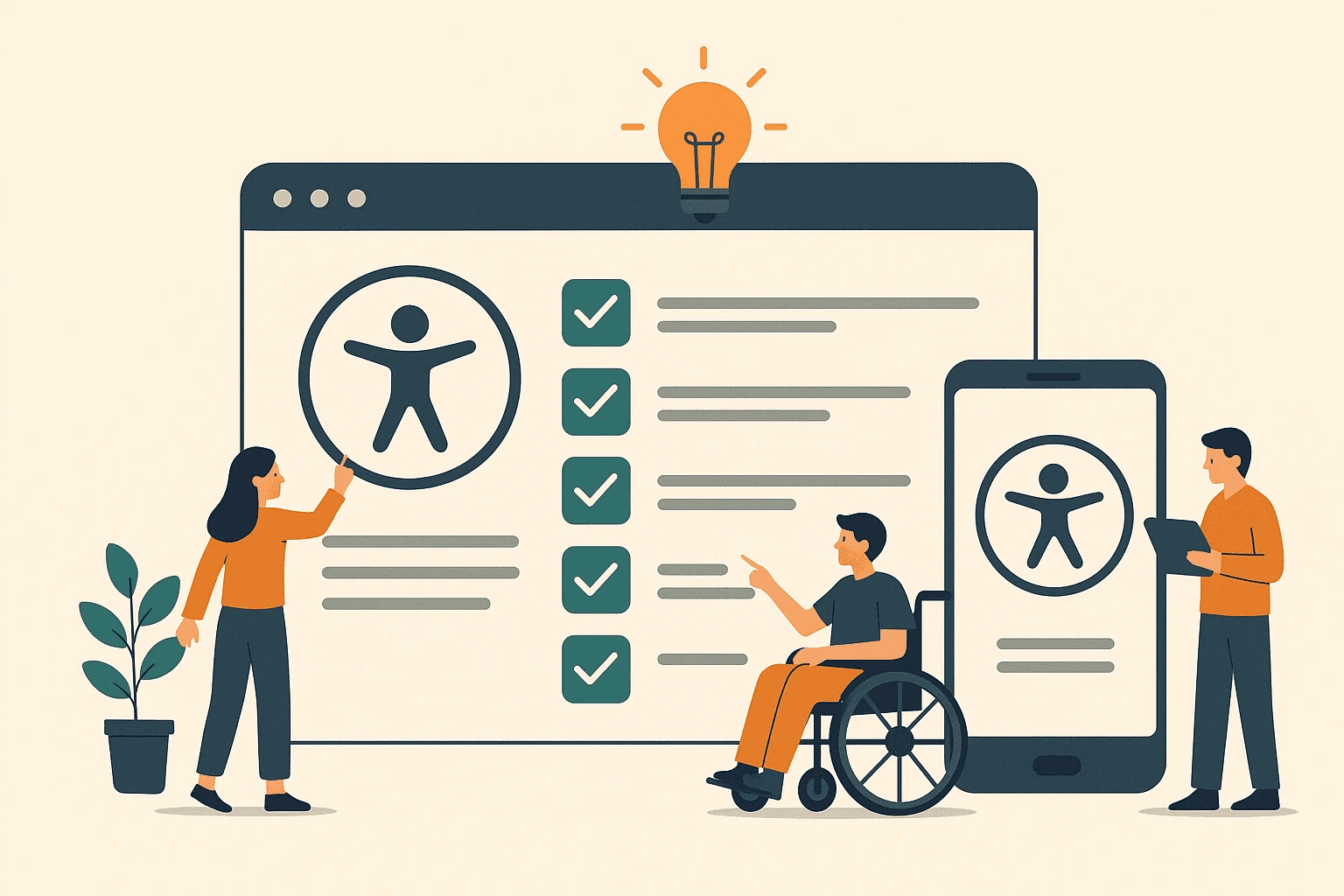
Accessibility in UI/UX design isn’t just a “nice-to-have” — it’s a necessity. In today’s digital world, millions of people rely on technology not just for entertainment, but for education, work, shopping, healthcare, and daily communication. Yet, without thoughtful design, many users encounter unnecessary barriers that make these experiences frustrating or even impossible to navigate.
Designing for accessibility means creating digital experiences that work for everyone, regardless of ability, device, or context. Whether a user has low vision, relies on keyboard navigation, uses a screen reader, or simply struggles with poor color contrast, an accessible interface can make the difference between inclusion and exclusion. It’s not just about meeting compliance standards like WCAG 2.1 — it’s about embracing inclusive design principles that improve usability for all.
The best part? Accessibility doesn’t just help people with disabilities. It benefits everyone. High-contrast text helps users in bright sunlight. Clear navigation aids both someone with a motor impairment and a busy parent holding a baby in one arm. Captions on videos are invaluable for people with hearing loss, but also for commuters watching on a noisy train. Accessibility is simply good design.
In this blog, we’ll break accessibility down into a practical 5-step UI/UX checklist that you can apply to your projects right away. No overwhelming lists, no vague theory — just clear, actionable steps that will make your designs more inclusive and user-friendly. Whether you’re a freelance designer, part of a startup team, or working at a large organization, these steps will help you design with empathy, clarity, and a global audience in mind.
By the end, you’ll have a clear framework for making your websites, apps, and digital products more accessible — and more successful.
Before you can design for accessibility, you need to understand the rules of the game. Accessibility isn’t just about making things look “simple” — it’s about following established guidelines that ensure your product is usable by the widest range of people possible.
The most widely recognized framework is the Web Content Accessibility Guidelines (WCAG), currently in version 2.1, created by the World Wide Web Consortium (W3C). WCAG breaks accessibility into four core principles, often remembered with the acronym POUR:
Perceivable — Information and user interface components must be presented in ways users can perceive (e.g., text alternatives for images, captions for videos).
Operable — Users must be able to interact with and navigate the interface (e.g., keyboard accessibility, sufficient time to complete tasks).
Understandable — Content and interface behavior must be clear and predictable (e.g., consistent navigation, avoiding jargon).
Robust — Content must work with a wide variety of user agents, including assistive technologies (e.g., proper use of HTML semantics, ARIA labels).
Understanding these principles will guide every design decision you make — from choosing colors to structuring navigation.
WCAG 2.1 builds upon earlier versions to address mobile accessibility, low-vision needs, and cognitive disabilities. Some critical checkpoints include:
Minimum color contrast ratios (4.5:1 for normal text, 3:1 for large text)
Support for screen magnification without breaking layouts
Avoiding content that triggers seizures (e.g., flashing animations)
Designing for touch targets that are easy to activate on mobile devices
While WCAG is the gold standard, different countries have their own regulations. For example:
ADA (Americans with Disabilities Act) in the U.S.
EN 301 549 in the EU
Equality Act in the UK
Even if you’re not legally bound by these, following them improves usability and future-proofs your design.
Visual accessibility is one of the most important elements of inclusive design. If users can’t clearly see or interpret content, they’ll likely miss key information, causing frustration and abandonment. By focusing on visual accessibility, you can ensure that everyone, regardless of their vision capabilities, can interact with your design.
Color contrast is essential for people with low vision or color blindness. A high contrast between text and background ensures readability and helps users with visual impairments distinguish elements clearly.
Contrast ratio: According to WCAG 2.1, the contrast ratio between text and its background should be at least 4.5:1 for regular text and 3:1 for large text (18pt or 14pt bold).
Text readability: Ensure your text is legible by choosing appropriate font sizes and styles. Avoid using small, condensed fonts or overly decorative typography that can hinder readability.
Color choices: Don’t rely on color alone to convey meaning. Combine color with text labels, icons, or patterns. For example, if red is used to indicate an error, provide a text label like “Error” or a symbol like a warning icon.
By using high-contrast combinations like dark text on a light background or light text on a dark background, you’ll make sure your content is accessible to users with low vision or color blindness.
Images and videos are essential elements of design, but without proper text alternatives, they can be completely inaccessible to users who rely on screen readers or have images disabled.
Alt text: Use descriptive alt text for all images, describing what the image is and its purpose. A picture of a person smiling might have the alt text: "A woman smiling at the beach, wearing sunglasses."
Transcripts and captions: For videos, provide transcripts and closed captions to ensure that people with hearing impairments can follow along. Additionally, ensure captions are synchronized with the audio.
Avoid image-only content: Whenever possible, avoid using images to convey important information (like buttons or links). Instead, use text-based alternatives that are screen reader-friendly.
By providing these alternatives, you’ll ensure users with disabilities or slower internet connections can still interact with your content.
Navigation accessibility is key to ensuring that users can interact with your interface effectively, especially for those who cannot use a mouse. Many people with physical disabilities or motor impairments rely on keyboard navigation or assistive devices to move through websites and apps.
To create a smooth and inclusive experience, make sure your designs are fully navigable with a keyboard alone. This is essential for people with mobility impairments or those using assistive technologies like switch devices or voice control.
A logical tab order ensures that users can navigate through interactive elements (links, buttons, form fields, etc.) in a predictable way, following the natural flow of the page.
Tab order: The order in which users navigate through the page using the "Tab" key should reflect the visual layout. For example, users should move from the logo to the main navigation, to the main content, and finally to the footer — in that exact order.
Focus indicators: When a user navigates to a link or form field, it’s essential to visually highlight the focused element. This can be achieved with a visible outline or border that makes it clear where the user's focus is.
Be sure to avoid removing the focus state entirely or using it inconsistently, as this can severely hinder navigation for keyboard and screen reader users.
Menus, buttons, and other interactive elements need to be easily accessible to everyone, including those who use keyboards and assistive technologies. Here’s how to make them accessible:
Clear labels: Ensure that all interactive elements (buttons, links, menu items) are clearly labeled and descriptive. For example, use "Submit Form" instead of just "Submit", so users know exactly what action they’re performing.
Skip to content links: Provide a “skip to content” link at the top of your pages, so users with screen readers or those using keyboard navigation can jump directly to the main content, bypassing repetitive navigation.
Accessible dropdowns: Dropdown menus and submenus should be navigable with the keyboard. Use the "Enter" and "Space" keys to expand the menu, and "Esc" to close it.
With clear, logical design and accessible interactive elements, you’ll make navigation smoother and more intuitive for all users.
Assistive technologies (AT) are tools that help users with disabilities interact with digital content. Common examples include screen readers, voice recognition software, and magnifiers. Ensuring your design works seamlessly with these tools is critical to making your website or app fully accessible.
When designing for assistive technologies, the key is ensuring that the content is properly structured and labeled so that these tools can interpret it correctly. Below are a few best practices to make your designs more compatible with assistive tech.
Screen readers are essential tools for people with visual impairments, converting text into speech or braille. To ensure your design works well with screen readers:
Semantic HTML: Use the appropriate HTML tags to structure your content. Headings (H1-H6) should be used in hierarchical order, lists should be marked up with <ul> or <ol>, and tables should have <thead>, <tbody>, and <tfoot> tags for better readability.
Descriptive links and buttons: Links and buttons should clearly describe their function. Instead of using generic text like "Click here," use something more specific like "Read more about accessibility best practices."
ARIA (Accessible Rich Internet Applications): ARIA roles, states, and properties can be used to enhance accessibility for complex elements like dynamic content or interactive components. For example, using aria-live="polite" for chat notifications allows screen readers to announce new messages in real time.
Landmark regions: Use HTML landmarks (<header>, <nav>, <main>, <footer>) to identify the main sections of your page. This helps screen reader users quickly navigate to specific parts of the content.
While semantic HTML is crucial for accessibility, ARIA labels can add extra context to dynamic elements that may not be adequately described by HTML alone.
ARIA labels: Use the aria-label attribute to provide additional descriptions for elements that lack visible text. For example, an icon for a search bar might need aria-label="Search button".
ARIA roles: Ensure that elements like modal dialogs, carousels, or accordions are properly identified using ARIA roles. This ensures assistive technologies can correctly interpret the elements and provide users with relevant information.
Remember that ARIA is a helpful enhancement, but should not be used as a substitute for proper HTML structure. The goal is to ensure that your site is usable by assistive technologies without needing too many ARIA modifications.
With these strategies in place, you’ll create a much smoother experience for users who rely on assistive technologies, helping them navigate your design with ease.
Creating an accessible design doesn’t end once the interface is live. To ensure that your product is truly inclusive, you need to test and iterate on it regularly. Accessibility testing helps uncover issues that might not be immediately obvious and ensures your design works across a variety of devices, browsers, and assistive technologies.
Testing isn’t a one-time task. It should be integrated into your design and development process to catch accessibility issues early and ensure continuous improvement.
There are a variety of tools available to help you identify and address accessibility issues. Some of these tools automate testing, while others help you manually evaluate the design. Here are a few popular ones:
Automated Tools:
Google Lighthouse: A free, open-source tool built into Chrome DevTools that provides an accessibility audit with suggestions for improvement.
WAVE: A free web accessibility evaluation tool that highlights potential accessibility issues in a webpage, such as missing alt text or poor contrast ratios.
axe Accessibility Checker: A browser extension that runs accessibility audits and gives you instant feedback on common accessibility issues.
Manual Testing:
Keyboard Navigation: Ensure that all interactive elements are fully navigable via keyboard. Test the tab order, focus states, and that forms can be filled out without a mouse.
Screen Reader Testing: Use a screen reader like NVDA or VoiceOver to test how well your website works with these tools. Listen carefully for any elements that are misinterpreted or not announced at all.
Color Contrast Checker: Use tools like Contrast Checker to ensure that your color choices meet the minimum accessibility contrast ratios.
While automated tools can catch many accessibility issues, it’s important to pair them with manual testing. This helps uncover issues related to dynamic content, complex interactions, and user experience, which automated tools often miss.
To ensure accessibility is part of the design process from the beginning, include accessibility checks at each stage of your project:
Wireframes & Prototypes: During the design phase, use high-contrast colors, simple fonts, and clear navigation paths. Tools like Figma and Sketch allow you to create accessible designs with built-in features for color contrast and text readability.
Code Review: Developers should regularly review code to ensure semantic HTML is being used, ARIA attributes are correctly applied, and interactive elements are keyboard-navigable. Tools like ESLint-plugin-jsx-a11y can help enforce accessibility best practices within the codebase.
User Testing: Conduct usability testing with people who have disabilities to gain real-world insights into how accessible your design is. User testing ensures you’re not missing accessibility challenges that might only be obvious to people with specific needs.
By regularly testing and iterating your designs with accessibility in mind, you’ll create an environment where inclusion isn’t just an afterthought but an integral part of the user experience.
Accessibility isn’t just about compliance — it’s about creating designs that work for everyone. By following this 5-step UI/UX checklist, you’ll be able to design products that are not only functional but also accessible, ensuring a positive experience for all users, regardless of their abilities.
By understanding accessibility guidelines, designing for visual and navigational ease, optimizing for assistive technologies, and continuously testing and iterating, you’ll ensure that your design meets the needs of a diverse, global audience. Plus, as you integrate accessibility into your workflow, you’ll create a more inclusive digital landscape that everyone can enjoy and benefit from.
Start today by applying these actionable steps to your projects — and watch your designs become more inclusive, usable, and impactful.
No bio available yet.
Accessibility and conversion are often treated like separate goals. In reality, many accessibility i
5 June 2026
UI/UX Design in 2026 is not just evolving. It is shifting at a pace that feels hard to ignore. New t
21 April 2026
Have you ever opened an app and instantly felt confused? Maybe you couldn’t find the button yo
8 April 2026
Be the first to share your thoughts
No comments yet. Be the first to comment!
Share your thoughts and join the discussion below.


