* All product/brand names, logos, and trademarks are property of their respective owners.
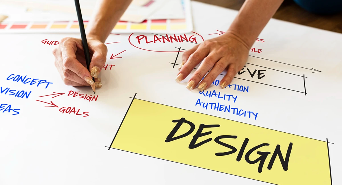
Ever looked at a design and thought, “Wow, that just works”? Whether it’s a social media graphic, a website, or a presentation slide — some designs effortlessly catch your eye and feel polished from the get-go.
Here’s the good news: you don’t need to be a seasoned designer or spend hours tweaking pixels to create visuals that stand out. The secret lies in a few simple, professional techniques that can transform your design instantly — even if you're just starting out.
In this post, we’re breaking down 7 pro design tips that will elevate your design game right away. These aren't complex theories or advanced design principles meant only for graphic design veterans. Instead, these are actionable, beginner-friendly techniques used by professionals across the globe — and they work whether you’re designing on Canva, Figma, Adobe tools, or even PowerPoint.
You’ll learn how to master the basics like alignment and white space, plus advanced tricks like contrast, hierarchy, and tool-based optimizations. Each tip is designed to make an instant visual impact — because sometimes, the smallest tweaks create the biggest transformations.
So whether you’re building your portfolio, designing a business pitch, running your own brand, or simply want to make your posts look more polished — this guide is for you.
Let’s dive into the first set of easy wins: the foundational fixes that immediately improve any design.
Design isn't just about creativity — it's about structure. The foundation of any strong visual begins with layout, spacing, and clarity. Let's explore the first three tips that can immediately boost your design’s quality and make it feel more professional.
Nothing screams "amateur" louder than random or inconsistent element placement. Alignment is one of the quickest and easiest ways to bring order to your designs.
Start by using grids or alignment guides — features available in tools like Canva and Figma — to line up text, images, and other elements. Whether you're going for left, center, or justified alignment, the key is consistency.
For example, aligning all text boxes to the same left margin instantly cleans up a slide or Instagram post. Think of alignment as the invisible skeleton that keeps your design strong and structured.
Also known as “negative space,” white space isn’t wasted space — it’s breathing room for your content.
Cramming too many elements into one design can overwhelm the viewer. Instead, allow for generous margins, padding around images, and gaps between text blocks. This creates a sense of calm and clarity, helping your message stand out.
A clutter-free design feels more luxurious, more readable, and far more professional. If you're ever unsure, try deleting one element — you'll often find the design looks instantly better.
Fonts do more than just display text — they set the tone. Using too many font types or choosing trendy fonts without purpose can derail your design.
Stick to 2 fonts max: one for headings and one for body text. Make sure they complement each other. For instance, pairing a bold sans-serif for titles with a clean serif for body copy creates balance and contrast.
Also, avoid overly decorative fonts unless they align with your brand or message. Clean, readable typography always wins.
Once your foundational elements are strong, it’s time to layer in the wow factor. These visual tricks are what separate basic designs from truly impactful ones — and the best part? You can implement them in minutes.
Contrast is about making elements stand out — and it’s one of the easiest ways to grab attention. You can create contrast through color, size, shape, or even spacing.
Start with color contrast: Use light text on dark backgrounds or vice versa. Make your call-to-action buttons a different color from the rest of your design to draw the eye. In text, vary the weight (bold vs. regular) or size of important words to emphasize key messages.
Pro tip: Use online tools like Coolors or Adobe Color to find color schemes that offer strong, balanced contrast.
Visual hierarchy guides the viewer’s eye from most important to least important content. Done right, it ensures your message is seen in the order you intend.
Use size, weight, color, and positioning to create this flow. For example, headlines should be larger and bolder than subtext. Calls-to-action should be prominent. Less important details? Keep them smaller and more subdued.
A well-structured hierarchy not only makes your design more readable — it also improves user experience, especially on web and mobile platforms.
Why start from scratch when powerful tools already exist to speed things up?
Platforms like Canva, Figma, and Adobe Express offer thousands of templates that are professionally designed and fully customizable. Use them as a base — then tweak colors, fonts, and layouts to match your brand or goal.
Also explore built-in features like auto-align, spacing tools, and smart layouts. They do the heavy lifting so you can focus on creativity. Using these tools isn’t “cheating” — it’s working smarter.
Design might seem like a mysterious art form, but at its core, it’s a series of thoughtful, intentional choices. The good news? You now have 7 powerful, pro-level tips that can instantly improve any design — whether you’re creating a pitch deck, social media post, blog graphic, or presentation slide.
Let’s recap:
Align everything — consistency is king.
Use white space — let your content breathe.
Choose fonts wisely — two max, and make them work together.
Add contrast — guide the viewer’s focus with color and size.
Structure hierarchy — make the most important info stand out.
Use design tools — work smarter, not harder.
Lean on templates — they're your secret weapon for speed and polish.
The beauty of these tips? They’re simple, but incredibly effective. You don’t need to be a professional designer to create eye-catching, high-quality visuals. All it takes is a bit of intention — and the willingness to tweak and test as you go.
So here’s your challenge: Open up your next design project — and apply just one of these tips. You’ll see a difference instantly. Apply all seven? You’ll be amazed at how pro your work looks.
No bio available yet.
Accessibility and conversion are often treated like separate goals. In reality, many accessibility i
5 June 2026
UI/UX Design in 2026 is not just evolving. It is shifting at a pace that feels hard to ignore. New t
21 April 2026
Have you ever opened an app and instantly felt confused? Maybe you couldn’t find the button yo
8 April 2026
Be the first to share your thoughts
No comments yet. Be the first to comment!
Share your thoughts and join the discussion below.


