* All product/brand names, logos, and trademarks are property of their respective owners.
Imagine walking into a well-organized room where your eyes naturally land on the most important elements first — a bold painting, a vibrant plant, or a cozy couch. That’s visual hierarchy in action. In design, whether it's a website, mobile app, magazine layout, or advertisement, visual hierarchy helps guide the viewer’s attention. It subtly tells the brain, “Look here first, then there.” This principle is one of the core pillars of effective design.
At its heart, visual hierarchy is about prioritization. Designers use it to make content more digestible, interactions smoother, and experiences more enjoyable. Whether you're a graphic designer, a UX/UI specialist, or just someone who cares about presenting information clearly, mastering visual hierarchy can drastically improve the quality of your work.
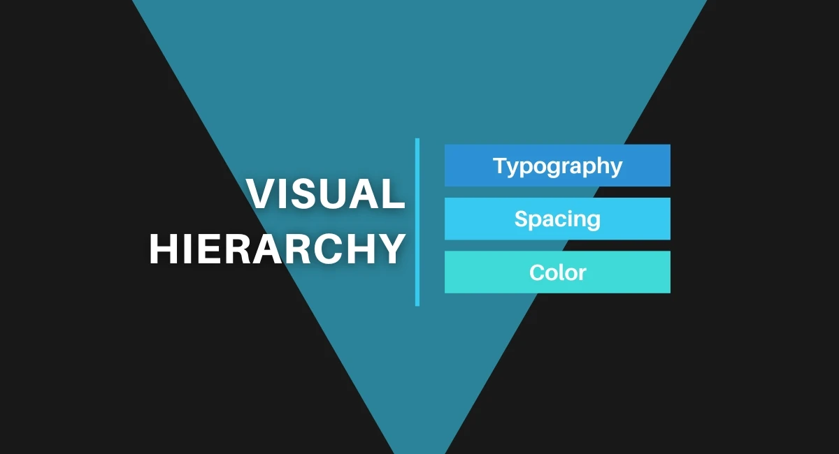
Three of the most essential tools in creating a strong visual hierarchy are typography, color, and spacing. Each plays a specific role:
Typography communicates importance through font size, weight, and style. A large, bold title screams “start here,” while smaller body text signals supporting details.
Color attracts the eye, creates contrast, and sets the mood. Designers often use bright or bold colors to highlight important information or create focal points.
Spacing (also known as white space) gives the design room to breathe. Proper use of spacing can group related elements and create flow, making it easier for users to navigate content.
Together, these elements are like a silent language. When used thoughtfully, they can make a layout feel intuitive, clean, and compelling. Throughout this blog, we’ll dive into how typography, color, and spacing work together — and how you can use them to build effective and beautiful designs with clear visual hierarchy.
Typography is one of the most powerful tools in a designer’s toolkit. It goes beyond choosing pretty fonts — it’s about how text communicates structure, importance, and emotion. A strong typographic hierarchy helps users know what to read first, what’s most important, and how to move through the content without feeling lost or overwhelmed.
Visual hierarchy thrives on contrast. Typography allows designers to use size, weight, and style to create contrast that catches the eye. For instance, headlines are typically much larger and bolder than body text. This tells the reader, “Start here.”
Different font weights — such as regular, medium, bold, and black — can also be used to emphasize certain elements. A light font might suggest a subtle or less-important note, while bold text can signal urgency or significance.
Styles like italics can imply secondary information, such as quotes or side notes. Combined, these elements guide a user’s eye down the page, making it easier to absorb the content in a logical flow.
A clear typographic hierarchy makes content scannable. Most successful designs follow a structured format: large titles (H1), subheadings (H2-H4), followed by body text. This structure isn't just for visual appeal — it supports how people naturally read and process information.
For example, blogs often start with a bold H1 title, followed by H2 sections that break content into digestible chunks. Each section may include smaller H3 or H4 subpoints. This makes it easy for readers to skim and find what they’re looking for quickly.
Consistently using this heading structure across designs improves both usability and SEO — a double win.
Font pairing is both an art and a science. Choosing the right combination of fonts can enhance readability and create a distinct visual voice. A popular approach is to pair a serif font for headlines with a sans-serif font for body text (or vice versa). This contrast adds sophistication without sacrificing clarity.
However, consistency is key. Using too many fonts can confuse the user and weaken the hierarchy. Most professional designs stick to two or three typefaces — one for headings, one for body, and maybe a third for accent elements like pull quotes or captions.
Brands like Apple, Google, and Airbnb use consistent typography systems across platforms, creating a seamless and recognizable experience for users.
Typography sets the tone, commands attention, and organizes information — making it the true foundation of any strong visual hierarchy.
While typography lays the foundation, color and spacing breathe life into design. They help draw attention, create relationships between elements, and enhance readability. These tools, when used wisely, can transform a flat layout into an intuitive and visually appealing experience.
Color does more than decorate — it communicates. Bright colors can highlight buttons or calls to action, while muted tones may recede into the background. Designers use color contrast to make sure important content stands out. For example, a bright yellow button on a navy background naturally draws the eye.
Color also creates visual groupings. By assigning the same color to related elements (e.g., all links in blue), users learn to associate color with function or meaning. This is especially useful in dashboards, infographics, or navigation menus.
Moreover, color can guide emotional response. Red signals urgency or error, green often means success or permission, and blue creates a sense of trust. Brands like Facebook and LinkedIn use blue to reinforce professionalism and reliability.
It’s also important to consider accessibility — not all users perceive color the same way. Tools like contrast checkers ensure that text remains legible for colorblind or visually impaired users.
Sometimes, what you don’t include is just as important as what you do. White space, also called negative space, is the empty area between elements. It's not wasted space — it creates breathing room and helps users focus.
Proper spacing:
Separates unrelated elements
Groups similar content
Reduces visual clutter
Enhances overall balance and flow
For example, Apple’s website famously uses generous white space to draw attention to product images and headlines. This not only makes the content more digestible but also creates a premium, clean aesthetic.
Using spacing strategically improves readability and reduces user fatigue, especially on mobile devices where screen real estate is limited.
A great design feels effortless — but behind that ease is careful planning. The interplay between typography, color, and spacing needs to feel natural and balanced.
Think of a website header: it might feature bold typography for the main message, a pop of color in the CTA button, and plenty of padding to give everything room to breathe. Each element supports the next, guiding the viewer's eye in a predictable and pleasing way.
Designers often rely on tools like grids, alignment, and consistent margins to maintain this harmony. When spacing is inconsistent or color choices clash, the whole design feels off — even if the user can’t quite explain why.
By mastering these elements, you ensure that your visual hierarchy not only looks great but also functions seamlessly, enhancing user experience and engagement.
Great design doesn’t happen by accident — it’s built on purpose. Typography, color, and spacing are your go-to tools for creating a clear, compelling visual hierarchy.
Typography gives structure. Color adds focus and emotion. Spacing provides clarity and flow.
Together, they help users navigate content effortlessly. Whether you're designing for web or print, using these tools with intention makes your message stronger and your design more user-friendly.
Keep it simple. Stay consistent. Design with the viewer in mind — and let hierarchy do the heavy lifting.
No bio available yet.
Web design improves faster when you stop guessing and start practicing with purpose. It is not only
3 June 2026
Think about the last time you tried to solve a problem and got stuck. Maybe you focused too much on
11 April 2026
Design isn’t just about aesthetics — it’s about creating solutions that genuinely
28 January 2026
Be the first to share your thoughts
No comments yet. Be the first to comment!
Share your thoughts and join the discussion below.


