Edesignify
UI/UX Design
Graphic Design
Web Design
Design Tools
Tutorials
Inspiration
Career & Freelancing
Resources
Design Trends
Design Thinking & Theory
Thursday, June 11, 2026
Edesignify
Edesignify

Explore expert content on UI/UX design, graphic design, and creative tools. Get access to step-by-step tutorials, design trends, free resources, portfolio tips, and freelance insights to grow your design career and sharpen your skills.

Follow us

Categories

  • UI/UX Design
  • Graphic Design
  • Web Design
  • Design Tools
  • Tutorials
  • Inspiration
  • Career & Freelancing
  • Resources
  • Design Trends
  • Design Thinking & Theory

Policies

  • About
  • Get inTouch Edesignify
  • Privacy Policy
  • Terms & Conditions
  • Disclaimer

Newsletter

Subscribe to Email Updates

Subscribe to receive daily updates direct to your inbox!

*We promise we won't spam you.

* All content on Edesignify is for educational and informational purposes only. All third-party names, trademarks, logos, or brands referenced on our site belong to their respective owners.
Edesignify claims no ownership over third-party intellectual property.

© 2026 Edesignify. A Project ofTETRA SEVEN. All Rights Reserved.

HomeTutorialsResponsive Web Layout Tutorial for Modern Designs (Step-by-Step)

Responsive Web Layout Tutorial for Modern Designs (Step-by-Step)

ByMusharaf Baig

19 February 2026

Responsive Web Layout Tutorial for Modern Designs (Step-by-Step)

* All product/brand names, logos, and trademarks are property of their respective owners.

46

views


FacebookTwitterPinterestLinkedIn

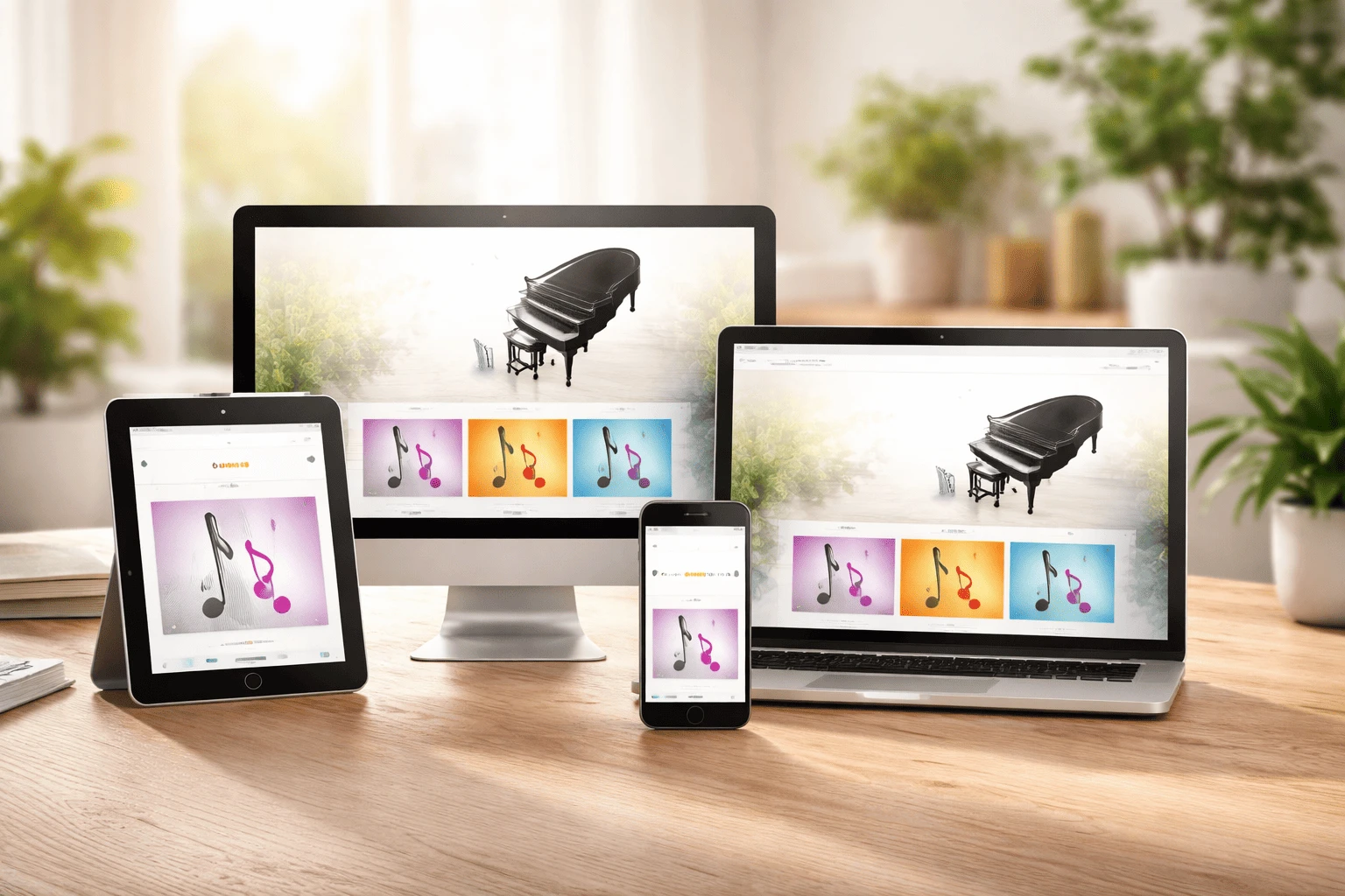
If your page looked perfect on a laptop but broke on a phone, you’ve met the reason responsive web design exists. People browse on all devices—small phones, large phones, tablets, laptops, widescreens, even split screens. A modern site must adapt naturally without broken spacing, sideways scrolling, or tiny text.

In this tutorial, we’ll use a mobile-first system: start with the smallest screen (~320px) to prioritize essential content, then scale up to tablets and desktops.

Core building blocks include:

  • Semantic HTML for clean, maintainable structure

  • Viewport meta tag for proper mobile scaling

  • Fluid layouts with %, rem, and viewport units

  • Flexbox for one-dimensional layouts

  • CSS Grid for two-dimensional structures

  • Smart breakpoints with media queries

  • Responsive images & fluid typography with clamp()

  • Touch-friendly UI adjustments

  • Testing with DevTools for performance

By following these steps, you’ll create layouts that look intentional and work seamlessly on every screen.

Step-by-Step: Build a Mobile-First Responsive Layout (From 320px Up)

Step 1 — Mobile-First Strategy (Design for 320px first)

The biggest mindset shift in modern responsive design is simple: start small. Designing for a 320px width forces clarity. You can’t rely on extra space to hide messy decisions. You have to prioritize what matters most—your headline, key actions, and the main content users came for.

Mobile-first helps because:

  • It keeps your layout focused. You design the core experience first.

  • It creates a lightweight foundation. Cleaner CSS, fewer layout hacks.

  • It scales up smoothly. Adding columns and spacing is easier than removing clutter.

Before you touch CSS, take 2 minutes to decide:

  • What must be visible immediately on mobile?

  • What can move lower on the page without hurting the experience?

  • What can be hidden behind a tap (like extra nav links in a menu)?

This quick planning step prevents the most common responsive layout problems later.

Step 2 — Core HTML Setup (Semantic structure + viewport)

A modern responsive layout starts with clean, semantic HTML. Use HTML5 tags like <header>, <main>, and <footer> so your structure is clear (and easier to style, maintain, and understand).

Here’s a simple starting structure:

<!DOCTYPE html>
<html lang="en">
<head>
  <meta charset="UTF-8" />
  <meta name="viewport" content="width=device-width, initial-scale=1.0" />
  <title>Responsive Layout Tutorial</title>
</head>
<body>
  <header class="site-header">
    <div class="container">
      <a class="logo" href="#">Brand</a>
      <nav class="site-nav">
        <a href="#">Home</a>
        <a href="#">Services</a>
        <a href="#">Blog</a>
        <a href="#">Contact</a>
      </nav>
      <a class="cta" href="#">Get Started</a>
    </div>
  </header>

  <main class="site-main">
    <section class="hero container">
      <h1>Modern Responsive Web Layout</h1>
      <p>Build layouts that look great on mobile, tablet, and desktop.</p>
    </section>
  </main>

  <footer class="site-footer">
    <div class="container">© 2026 Brand</div>
  </footer>
</body>
</html>

The viewport meta tag is non-negotiable:

<meta name="viewport" content="width=device-width, initial-scale=1.0">

Without it, mobile browsers may render your site on a “fake” wider canvas and shrink everything down—making text tiny and the layout feel broken.

Step 3 — Fluid Layout Rules (No fixed pixels)

A responsive layout breaks when it depends on fixed widths like 1200px. Instead, use fluid units:

  • % for flexible container widths

  • rem for consistent spacing and typography

  • vw/vh for viewport sizing (use carefully)

  • max-width to prevent overly wide layouts

A simple container pattern works in almost every project:

* { box-sizing: border-box; }
body { margin: 0; font-family: system-ui, Arial, sans-serif; line-height: 1.5; }

.container {
  width: min(1100px, 100% - 2rem);
  margin-inline: auto;
}

Now your layout adapts on small screens and stays readable on large screens.

Also, know the difference between Flexbox and Grid:

  • Flexbox: best for one-dimensional layout (rows or columns)—navbars, button groups, centering.

  • CSS Grid: best for two-dimensional layout (rows and columns)—full page structure and card grids.

Modern Layout Patterns Using Flexbox + CSS Grid

Pattern 1 — A Modern Header (logo + nav + CTA)

A modern header usually has three parts: a logo, navigation links, and a call-to-action button. Mobile-first means the nav can be hidden initially, then enabled later with breakpoints.

.site-header {
  position: sticky;
  top: 0;
  background: white;
  border-bottom: 1px solid #eee;
  z-index: 10;
}

.site-nav { display: none; } /* mobile-first */

.cta {
  text-decoration: none;
  background: #111;
  color: #fff;
  padding: 0.75rem 1rem;
  border-radius: 999px;
  font-weight: 600;
}

This gives you a clean header on mobile. On tablet/desktop, you’ll show the full nav.

Pattern 2 — Responsive Hero + Content Section

A hero section usually stacks on mobile (headline → text → buttons). On larger screens, it can become a two-column layout. Here’s the mobile base styling:

.hero { padding-block: 3rem; }
.hero h1 { margin: 0 0 0.75rem; font-size: 2rem; letter-spacing: -0.02em; }
.hero p  { margin: 0; color: #444; max-width: 60ch; }

Later, you’ll upgrade it into a two-column layout using Grid—text on the left, visual on the right.

Pattern 3 — Responsive Card Grid (portfolio/blog/eCommerce)

Card grids are everywhere: blog lists, product grids, portfolios. Start mobile-first with one column:

.card-grid {
  display: grid;
  grid-template-columns: 1fr;
  gap: 1rem;
}
.card {
  border: 1px solid #eee;
  border-radius: 18px;
  padding: 1.25rem;
  background: white;
  box-shadow: 0 8px 20px rgba(0,0,0,0.04);
}

Then use breakpoints—or a modern auto-fit trick—to scale up.

Breakpoints That Make Sense (And Don’t Break Your Design)

Step 4 — Smart Breakpoints with Media Queries

Breakpoints shouldn’t feel random. Use them when the layout starts to feel tight. Still, these are common modern baseline breakpoints:

  • Mobile: ≤480px

  • Tablet: 768px

  • Laptop/Desktop: 1024px–1366px+

Mobile-first media query structure:

@media (min-width: 768px) { /* tablet upgrades */ }
@media (min-width: 1024px) { /* desktop upgrades */ }
@media (min-width: 1366px) { /* large screens */ }

Enable navigation on tablet:

@media (min-width: 768px) {
  .site-nav { display: flex; gap: 1rem; }
  .site-nav a { text-decoration: none; color: #111; padding: 0.6rem 0.75rem; border-radius: 10px; }
}

Upgrade hero to two columns on desktop:

 
@media (min-width: 1024px) {
  .hero-grid { display: grid; grid-template-columns: 1.1fr 0.9fr; gap: 2rem; align-items: center; }
  .hero h1 { font-size: 3rem; }
}

For the card grid, you can choose:

Option A (classic): 2 columns on tablet, 3 on desktop, 4 on large screens.
Option B (modern): auto-fit grid:

.card-grid {
  grid-template-columns: repeat(auto-fit, minmax(220px, 1fr));
}

Option B is super clean and adapts smoothly.

Responsive Images + Fluid Typography (Modern Feel Without Extra Work)

Step 5 — Responsive Media (Images that never overflow)

Use this rule to prevent image overflow:

img { max-width: 100%; height: auto; display: block; }

For performance, serve the right image size using srcset:

<img
  src="hero-800.jpg"
  srcset="hero-480.jpg 480w, hero-800.jpg 800w, hero-1200.jpg 1200w"
  sizes="(max-width: 768px) 100vw, 50vw"
  alt="Modern responsive layout preview"
/>

This helps mobile users load faster without losing quality on larger screens.

Fluid Typography with clamp()

clamp() creates fluid type that scales smoothly between a minimum and maximum size:

:root {
  --step-0: clamp(1rem, 0.95rem + 0.3vw, 1.125rem);
  --step-2: clamp(1.6rem, 1.3rem + 1.5vw, 2.5rem);
  --step-3: clamp(2rem, 1.6rem + 2.2vw, 3.25rem);
}

body { font-size: var(--step-0); }
.hero h1 { font-size: var(--step-3); }
h2 { font-size: var(--step-2); }

Add this small UX polish for readable line length:

p { max-width: 65ch; }

Finishing Touches: Touch UI + Testing + Optimization

Step 6 — Touch-Friendly UI Adjustments

Touch screens need bigger targets. A common standard is 48x48px tap area:

.btn, .cta, .site-nav a {
  min-height: 48px;
  display: inline-flex;
  align-items: center;
  justify-content: center;
}

Also, avoid hover-only navigation on mobile. Replace complex hover menus with patterns like a hamburger menu (or a simple toggle).

Step 7 — Testing & Optimization (Don’t ship blind)

Test your responsive design with:

  • Chrome DevTools → Toggle Device Toolbar (check 320px, 375px, 480px, 768px, 1024px)

  • BrowserStack → real cross-browser testing (especially iOS Safari)

  • Google PageSpeed Insights → find heavy images/scripts slowing mobile users

What to check during testing:

  • Any horizontal scrolling?

  • Are buttons easy to tap?

  • Does text stay readable without zoom?

  • Do images load fast and scale correctly?

Conclusion

Responsive design is simpler when you treat it like a system, not guesswork. Start mobile-first, build a semantic foundation, and use fluid layouts so elements stretch and shrink naturally. Add smart breakpoints only when the layout feels tight, then enhance with responsive media, fluid typography, and touch-friendly UI. Remember this rule: responsive design isn’t about chasing devices—it’s about graceful adaptation. Apply it to a small project, like a portfolio page, blog homepage, or eCommerce grid. Use Grid and Flexbox, test early in DevTools, and after a few projects, creating modern, adaptable layouts becomes fast, natural, and intuitive.

Read Also


Mastering Typography: Beginner to Advanced Design Principles

Tags:TypographySans SerifCSS GridWeb DesignChrome DevToolsFluid TypeTouch UI
Musharaf Baig

Musharaf Baig

View profile

Mushraf Baig is a content writer and digital publishing specialist focused on data-driven topics, monetization strategies, and emerging technology trends. With experience creating in-depth, research-backed articles, He helps readers understand complex subjects such as analytics, advertising platforms, and digital growth strategies in clear, practical terms.

When not writing, He explores content optimization techniques, publishing workflows, and ways to improve reader experience through structured, high-quality content.

Related Posts

AI Design Briefs in 2026: How Designers Can Turn Vague Client Prompts into Usable UI DirectionTutorials

AI Design Briefs in 2026: How Designers Can Turn Vague Client Prompts into Usable UI Direction

Clients rarely arrive with perfect briefs. They say things like "make it modern," "use AI," "make it

By: Feroza Arshad

5 June 2026

Figma AI Workflow in 2026: How Designers Can Use AI Without Losing Craft, Control, or AccessibilityTutorials

Figma AI Workflow in 2026: How Designers Can Use AI Without Losing Craft, Control, or Accessibility

AI is now deeply woven into design tools, and Figma is one of the clearest examples. Designers are u

By: Feroza Arshad

4 June 2026

Why Personal Branding Matters More Than Ever in Digital MarketingTutorials

Why Personal Branding Matters More Than Ever in Digital Marketing

Scroll through LinkedIn, Instagram, or even X, and one thing becomes obvious—people are paying

By: Feroza Arshad

22 April 2026

Comments

Be the first to share your thoughts

No comments yet. Be the first to comment!

Leave a Comment

Share your thoughts and join the discussion below.

Popular News

AI Design Briefs in 2026: How Designers Can Turn Vague Client Prompts into Usable UI Direction

AI Design Briefs in 2026: How Designers Can Turn Vague Client Prompts into Usable UI Direction

By:Feroza Arshad  5 June 2026

A practical workflow for designers using AI to turn vague client prompts into clear UI direction, content structure, accessibility notes, and design decisions.

Read More
Accessibility-First Landing Pages: A 2026 Checklist for Designers Who Want Better Conversions

Accessibility-First Landing Pages: A 2026 Checklist for Designers Who Want Better Conversions

By:Feroza Arshad  5 June 2026

A practical 2026 landing page checklist for designers covering contrast, forms, buttons, content hierarchy, mobile layout, motion, and conversion clarity.

Read More
Human-Crafted Visual Design in 2026: How to Add Texture, Personality, and Trust Without Hurting UX

Human-Crafted Visual Design in 2026: How to Add Texture, Personality, and Trust Without Hurting UX

By:Feroza Arshad  4 June 2026

Learn how designers can use texture, handmade details, illustration, and warmer brand systems in 2026 without sacrificing usability or accessibility.

Read More
Figma AI Workflow in 2026: How Designers Can Use AI Without Losing Craft, Control, or Accessibility

Figma AI Workflow in 2026: How Designers Can Use AI Without Losing Craft, Control, or Accessibility

By:Feroza Arshad  4 June 2026

A practical Figma AI workflow for 2026 covering ideation, layout cleanup, design systems, accessibility, handoff, and where human judgment still matters.

Read More
How to Boost Your Web Design Skills Quickly and Effectively

How to Boost Your Web Design Skills Quickly and Effectively

By:Feroza Arshad  3 June 2026

Learn practical ways to improve your web design skills faster with design practice, UX basics, feedback, tools, and a 30-day plan.

Read More
Boost Your Freelance Career with These Design Strategies

Boost Your Freelance Career with These Design Strategies

By:Feroza Arshad  30 May 2026

Discover practical design strategies to attract better clients, strengthen your portfolio, increase your rates, and grow a successful freelance design career.

Read More
Top Inspirational Resources to Help You Unlock Your Creativity

Top Inspirational Resources to Help You Unlock Your Creativity

By:Feroza Arshad  26 May 2026

Discover the best inspiration resources, creative tools, and practical ideas to help you stay motivated and unlock your creativity every day.

Read More
Kling AI 3.0 Brings One-Click 4K Video Generation to Creators

Kling AI 3.0 Brings One-Click 4K Video Generation to Creators

By:Feroza Arshad  23 May 2026

Kling AI 3.0 brings one-click 4K video generation, faster workflows, and cinematic AI tools for creators, marketers, and filmmakers.

Read More
The Future of WordPress Starts with AI in Version 7.0

The Future of WordPress Starts with AI in Version 7.0

By:Nigarish Nadeem  22 May 2026

WordPress 7.0 introduces built-in AI integration, smarter editing tools, automation support, and new developer-focused AI features.

Read More
Why Figma Has Become the Favorite Design Tool for Teams

Why Figma Has Become the Favorite Design Tool for Teams

By:Nigarish Nadeem  12 May 2026

Discover why Figma became the preferred design tool for modern teams through real-time collaboration, cloud access, and faster workflows.

Read More