* All product/brand names, logos, and trademarks are property of their respective owners.
User interfaces are evolving — and 2025 is shaping up to be a year defined by bold aesthetics, improved accessibility, and user-first design. Two trends that have stolen the spotlight recently are dark mode and neomorphism (also spelled neumorphism). While they might seem like just “visual preferences,” they actually reflect a deeper shift in how we think about user experience, digital comfort, and design innovation.
Dark mode, once a niche developer setting, is now everywhere — from operating systems and apps to websites and even email platforms. It’s more than just an aesthetic choice. It helps reduce eye strain, conserves device battery life on OLED screens, and delivers a sleek, modern feel. Meanwhile, neomorphism offers a soft, tactile interface style that mimics physical surfaces using subtle shadows and highlights. It’s eye-catching and minimal, making interfaces feel almost 3D without overwhelming users with heavy design elements.
These two UI styles seem to live in different universes: one is sleek and dark, the other light and soft. But together, they’re inspiring a new generation of digital designs that feel modern, functional, and delightfully unique. In this blog, we’ll explore why these styles are trending, how to implement them effectively, and what design best practices can help you avoid common pitfalls.
Whether you're a designer seeking inspiration or a developer looking to level up your UI game, this blog breaks down the what, why, and how of dark mode and neomorphism — with real-world examples, practical tips, and plenty of modern UI inspiration to spark your next project.
Dark mode isn't just a trend — it’s quickly becoming a user expectation. One major reason for its popularity is visual comfort. By reducing screen brightness, dark mode helps minimize eye strain, especially in low-light environments. This makes it ideal for night-time browsing, binge-scrolling, or working late hours without the harsh glow of white screens.
Another factor? Battery efficiency. On OLED and AMOLED displays, dark pixels consume less power than light ones. This leads to extended battery life — a win for mobile-first users. But beyond utility, dark mode has serious aesthetic appeal. It brings a sleek, modern look to apps and websites, making content feel more immersive and professional.
Apps like Twitter, YouTube, and Instagram have embraced dark themes, and users often gravitate toward apps that offer theme-switching capabilities. For many, it’s not just a preference — it’s an accessibility feature and a part of digital wellness.
While dark mode may look simple, it’s easy to get it wrong without careful planning. The first rule? Don’t just invert your colors. A true dark UI requires thoughtful design adjustments, like tweaking saturation, avoiding pure black (#000000), and ensuring text contrast meets accessibility standards (at least a 4.5:1 contrast ratio for body text).
Use off-blacks, dark grays, and muted color palettes to soften the overall feel and maintain legibility. UI elements like buttons and icons should be clearly distinguishable without blending into the background. Also, remember that not all images and logos work well on dark backgrounds — opt for transparent PNGs or SVGs when possible.
Lastly, dark mode should be optional, with a seamless toggle or automatic system-based detection. Users appreciate control over their viewing experience, and forcing a dark interface without that choice can backfire.
Ready to bring dark mode into your next project? Here are some tools and resources to help you get it right:
Figma & Adobe XD: Both offer dark UI kits and allow for easy theme switching during design.
CSS Media Queries: Use @media (prefers-color-scheme: dark) to detect system preferences.
Contrast Checkers: Tools like WebAIM’s contrast checker or Stark plugin help ensure text and UI accessibility.
Design Inspiration: Websites like Dribbble and Behance are full of beautifully executed dark mode projects.
Embracing dark mode can enhance both form and function — when done with care. It’s more than just a theme; it’s a way to make your UI feel thoughtful, refined, and future-ready.
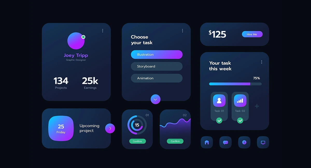
Neomorphism — or neumorphism, as it’s often spelled — is a UI design trend that blends the minimalism of flat design with the depth and realism of skeuomorphism. The result? A subtle, soft 3D aesthetic that makes interface elements appear to rise from or sink into the background.
This effect is achieved through clever use of light and shadow — typically using dual box-shadows in CSS, one light and one dark, to simulate soft edges. Buttons, toggles, and cards appear as though they’re part of the same surface, giving the interface a clean, tactile feel.
Unlike traditional skeuomorphism, which mimics real-world textures and objects, neomorphism is more abstract. It maintains a modern, minimalist look while still feeling interactive and approachable. It's no surprise that it's found a home in apps, dashboards, and portfolio websites that aim to stand out without going overboard.
Why designers love it: Neomorphism feels fresh and futuristic. It’s minimal yet textured, simple yet elegant. It gives interfaces a unique visual identity without relying on loud colors or complex layouts. For branding, this can be a game-changer — especially for digital products that want to communicate sophistication.
But here's the catch: Neomorphism isn’t always user-friendly. Because of its low contrast and soft edges, it can struggle with accessibility. Buttons may look inactive, and text may not pop enough for users with vision impairments. There's also limited visual feedback — the UI can feel static if not designed carefully.
From an implementation standpoint, neomorphism can be a challenge on responsive layouts or when dark mode is enabled — because shadow depths and contrast levels must be adjusted for different backgrounds and lighting contexts.
TL;DR: Neomorphism is beautiful but needs to be balanced with usability. It’s great for aesthetics, but not ideal for high-interaction or content-heavy interfaces — unless adapted thoughtfully.
Some of the most compelling neomorphic UIs come from design showcases on platforms like Dribbble, Awwwards, and Behance. Dashboards, calculators, weather apps, and smart home controls are frequent candidates for this style.
Styling tips for achieving neomorphism:
Use a monochrome or pastel color palette — too much color disrupts the soft look.
Shadows are key: a light shadow on the top-left (box-shadow: -5px -5px 15px #ffffff) and a dark one on the bottom-right (box-shadow: 5px 5px 15px rgba(0, 0, 0, 0.1)) create the classic “pressed” effect.
Maintain ample spacing — neomorphic elements need room to breathe to stand out.
Add hover and active states to improve interactivity and help users understand what's clickable.
Pro tip: Neomorphism pairs beautifully with dark mode, creating a hybrid "dark soft UI" that feels both futuristic and immersive.
As we look toward the future of digital design, it’s clear that user expectations are changing. Aesthetic isn’t just about beauty — it’s about function, comfort, and accessibility. Both dark mode and neomorphism are at the forefront of this shift, proving that great design can be both elegant and user-friendly when executed thoughtfully.
Dark mode has moved from optional extra to a must-have feature, not just for its sleek look but for its ability to enhance usability and reduce digital fatigue. It’s not a passing trend — it’s now a core component of modern UX strategy. Meanwhile, neomorphism offers a softer, tactile experience that breaks away from the rigid flatness we’ve grown used to. Its visual charm is undeniable, especially when it’s handled with a careful eye toward accessibility.
The exciting part? These two trends don’t have to live in separate worlds. In fact, the fusion of dark mode and neomorphism creates a uniquely immersive experience — a soft, modern interface that feels both futuristic and deeply human. By applying best practices in contrast, spacing, and interactivity, designers can balance innovation with inclusivity.
Whether you’re redesigning a dashboard, building a new app, or refreshing your portfolio, take inspiration from these trends. Test your designs. Play with shadows and color palettes. Embrace the elegance of simplicity — and always keep the user in focus.
Ready to create your own dark + neo-inspired design?
Explore tools like Figma, start with pre-built UI kits, or code your own vision using CSS box-shadows and dark media queries. There’s never been a better time to innovate.
No bio available yet.
Scroll through Pinterest or Instagram for a few minutes, and you’ll start noticing a pattern&m
18 April 2026
Lately, there’s a quiet feeling many of us share, even if we can’t quite name it. We scr
21 February 2026
Whether you’re a designer building your first app or a seasoned creative working on your next
22 January 2026
Be the first to share your thoughts
No comments yet. Be the first to comment!
Share your thoughts and join the discussion below.


.webp&w=3840&q=75)


