* All product/brand names, logos, and trademarks are property of their respective owners.
Claymorphism is a modern design style characterized by soft, 3D-like visuals that mimic objects molded from clay or inflatables. It uses chunky shapes, smooth gradients, and a specific shadow recipe to make elements look tactile and “pressable.” The big reason it caught fire around 2021–2022 is simple: it felt like a fresh evolution of neumorphism — but with fewer usability problems. Neumorphism had a beautiful, subtle depth, but it often suffered from low contrast and unclear click targets. Claymorphism keeps the soft 3D vibe, but introduces higher contrast, more distinct layering, and brighter color palettes, making UI components easier to recognize and interact with.
For graphic designers, this trend is more than a visual gimmick. It’s part of a broader movement toward emotion-driven UI — interfaces that feel friendly, modern, and human. As we move deeper into 2026, the global push toward 3D UI design trends and interactive micro-experiences makes claymorphism even more relevant. In this blog, we’ll break down what claymorphism is, how it evolved, how it compares to neumorphism, and how it’s transforming modern web design — plus practical tips to implement it without making your interface look childish.
Claymorphism is one of those styles that makes people pause for a second. It feels playful, soft, and oddly touchable — even though it’s just pixels. At its core, claymorphism in web design uses inflated, rounded UI elements with layered shadows that create a “floating” 3D effect. Think pill-shaped cards, chunky buttons, and icons that look gently puffed up.
What makes it different from older 3D styles is how it handles depth. Instead of making elements look embedded into the same surface (like neumorphism), claymorphism makes them feel like separate objects sitting on top of the background — clearer, bolder, and easier to use.

UI trends tend to swing like a pendulum between realism and simplicity. Skeuomorphism was the early “real-world mimic” era: textures, shadows, and objects that looked physical (like leather notebooks and shiny buttons). It helped users understand digital interfaces when smartphones were still new, but it often felt heavy and visually cluttered.
Then came flat design, which removed depth almost entirely. Clean layouts, bold colors, simple icons. It looked modern and scaled well — but over time, flat design sometimes made interfaces feel too uniform. When everything looks the same, users don’t always know what’s clickable.
Neumorphism tried to bring depth back with soft highlights and shadows, making elements look embossed or extruded from a single surface. It was visually pleasing, but in real products, it struggled: low contrast and subtle edges made it tough for accessibility and usability. Claymorphism builds on neumorphism’s softness, but solves its biggest weaknesses by using:
clearer separation between layers
stronger, more readable contrast
brighter pastel colors and gradients
a more obvious “pressable” feel
In short, it brings back depth in a way that works better for modern interfaces.
Claymorphism has a recognizable “recipe.” If you want to spot it (or recreate it), these are the most common features graphic designers rely on:
1) Inflated Geometry (Extreme Roundness)
Elements look puffy and “inflated.” Corners are often pushed to 50%+ roundness, with chunky shapes and no sharp edges. This is why claymorphism UI design feels friendly and approachable.
2) Multi-Layered Shadowing (The Depth Formula)
This is the signature move. Claymorphism typically uses:
Two inner shadows: a lighter highlight on the top-left and a darker shadow on the bottom-right to create volume.
One outer shadow: a deeper drop shadow that makes the element look like it floats above the background.
This combo creates the clay-like “puff” and also makes click targets more obvious.
3) Vibrant Pastel Palettes + Smooth Gradients
Unlike neumorphism’s monochrome limitation, claymorphism thrives on vivid pastels and gentle gradients. That color lift helps with clarity, hierarchy, and mood.
4) Minimal Typography
Because the UI shapes already have a lot of personality, typography is usually clean and bold — simple sans-serif fonts, clear hierarchy, and plenty of spacing to keep everything readable.
Here’s an easy way to remember the difference:
Material metaphor
Neumorphism: embossed plastic / extruded paper
Claymorphism: clay, Play-Doh, inflatables
Background relation
Neumorphism: elements feel part of the same surface
Claymorphism: elements float as distinct objects
Shadow technique
Neumorphism: one light + one dark shadow
Claymorphism: dual inner shadows + deep outer shadow
Contrast & colors
Neumorphism: low contrast, often monochromatic
Claymorphism: higher contrast, brighter pastels
Usability
Neumorphism: can fail accessibility needs
Claymorphism: clearer layers and clickability
If you’re designing for real users — not just concept shots — claymorphism often lands better.
Claymorphism is trending because it changes how users feel when interacting with a product. Modern web design is no longer only about clean layouts — it’s about creating experiences that feel intuitive, friendly, and interactive. With claymorphism, UI elements don’t just sit there. They look pressable, they invite interaction, and they pair naturally with subtle motion. That’s why this style is showing up in modern landing pages, app onboarding flows, and dashboard concepts worldwide.

1) Call-to-Action (CTA) Buttons
Clay-style buttons look more “pressable,” which can improve clarity and encourage clicks. With a small hover or press animation (scale down slightly, shadow tighten), the tactile illusion becomes even stronger — and CTAs feel more intuitive.
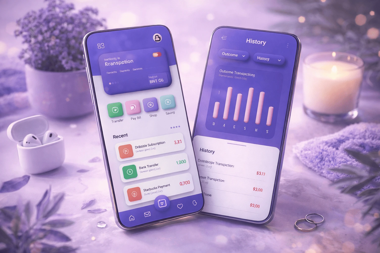
2) Charts and Data Visualization
Dashboards can feel cold and technical. Claymorphism softens that. Puffy cards and layered widgets can make complex data feel more approachable and scannable, especially in SaaS and fintech UI.
3) Custom 3D Illustrations and Avatars
Clay-like characters and icons are often used to humanize tech branding — from onboarding mascots to playful 3D avatars (think modern “Snoo”-style updates and NFT-inspired characters). For graphic designers, this is a big creative playground.
4) Micro-Interactions and Motion
Claymorphism pairs perfectly with micro-animations: cards lift on hover, buttons compress on click, toggles feel like soft switches. Motion adds realism — and realism boosts delight.
One reason claymorphism has staying power is that it fixes the biggest complaint about neumorphism: clarity. Because elements float above the background and use stronger contrast, users can more easily identify:
clickable buttons
active states
card boundaries
hierarchy and grouping
That said, claymorphism can go wrong if overused. Too many inflated shapes and too much color can make an interface feel childish or toy-like. Design tip: Use claymorphism for emphasis — CTAs, key widgets, hero visuals — and balance it with whitespace, structured grids, and minimal typography to keep the experience modern and professional.
If you want to try claymorphism in modern web design, start simple:
Shape first: push the corner radius high, avoid sharp edges.
Shadow recipe: two inner shadows (light top-left, dark bottom-right) + one deeper outer shadow.
Color: choose soft-but-vivid pastels, add gentle gradients, and keep enough contrast from the background.
Typography: clean, bold sans-serif fonts with clear hierarchy.
Restraint: don’t inflate everything — highlight what matters.
Whether you’re building a landing page, a product dashboard, or a portfolio, claymorphism can add personality and depth — as long as usability stays in the driver’s seat.
Claymorphism isn’t just a cute visual style. It reflects a bigger shift: users want digital products to feel more human. Soft depth, friendly shapes, and tactile interactions create a sense of comfort — and comfort builds trust. Still, claymorphism isn’t for every project. It shines in creative brands, startups, modern SaaS, fintech dashboards, mobile apps, and portfolio sites — but may not fit highly formal industries like legal, government, or conservative enterprise tools.
The smartest approach is to treat claymorphism as a tool, not a rule. Use it where it improves clarity and delight — especially in CTAs, feature highlights, onboarding, and key UI components — and keep the rest of your layout clean and structured. Looking ahead, the direction is clear: flat, lifeless interfaces are fading. More dimensional, interactive, and emotionally engaging design is rising — and claymorphism is part of that wave. If you’re a graphic designer, this is a great time to experiment. Build a claymorphic button set, test a dashboard card system, explore 3D illustrations, and see how people respond. Because the future of design isn’t only about what looks good. It’s about what feels good to use.
Related Article
How Fresh Aesthetic Trends Are Transforming the Future of Graphic Design

Mushraf Baig is a content writer and digital publishing specialist focused on data-driven topics, monetization strategies, and emerging technology trends. With experience creating in-depth, research-backed articles, He helps readers understand complex subjects such as analytics, advertising platforms, and digital growth strategies in clear, practical terms.
When not writing, He explores content optimization techniques, publishing workflows, and ways to improve reader experience through structured, high-quality content.
You opened Canva or Figma for the first time, made something, and thought "this looks nothing like w
29 April 2026
Scroll through any design forum or beginner group, and you’ll notice a pattern—people co
27 April 2026
If you scroll through Instagram, watch a YouTube video, or even look at a product package, you&rsquo
10 April 2026
Be the first to share your thoughts
No comments yet. Be the first to comment!
Share your thoughts and join the discussion below.


