* All product/brand names, logos, and trademarks are property of their respective owners.
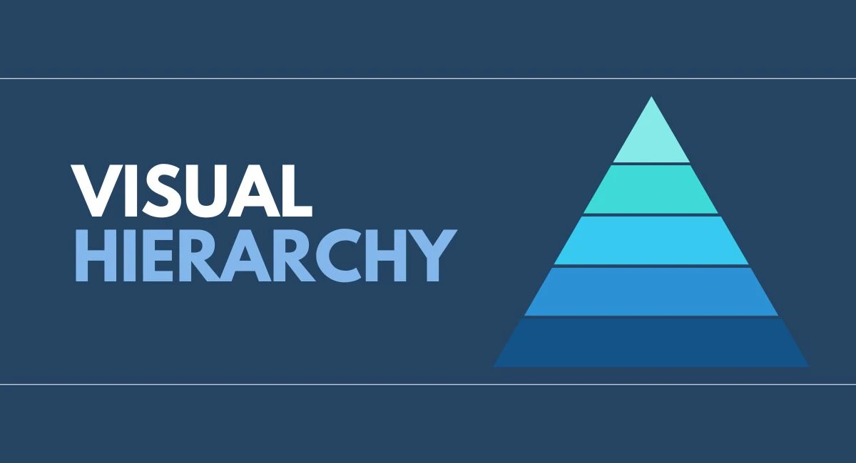
In the world of UI and UX design, there’s a silent hero working behind the scenes to guide users through digital experiences — it’s called visual hierarchy. You’ve probably experienced it without even realizing it. Ever noticed how your eyes are immediately drawn to a bold headline, a brightly colored button, or a large image when you land on a website? That’s visual hierarchy in action.
At its core, visual hierarchy is the arrangement and presentation of design elements in a way that suggests importance. It’s about organizing content so that users naturally gravitate toward the most critical information first, then continue down a path of supporting details. Whether it’s a call-to-action, a product feature, or a navigation menu, effective visual hierarchy ensures users know what to look at — and in what order.
This principle is foundational in both UI (User Interface) and UX (User Experience) design. A well-structured hierarchy not only makes interfaces visually pleasing but also functional. It’s what separates an intuitive design from a confusing one. Without it, users may feel lost, overwhelmed, or simply uninterested in continuing their journey on your site or app.
Understanding visual hierarchy is especially important in today’s digital age, where attention spans are short and competition for engagement is fierce. Designers need to make snap decisions on layout, typography, color, and spacing — all of which influence how information is perceived and prioritized.
In this blog, we’ll break down the core principles of visual hierarchy and explore how they’re applied in real-life UI and UX design. From size and scale to contrast and proximity, you’ll learn how to structure your designs to improve usability, boost engagement, and create a seamless user journey.
Understanding visual hierarchy starts with recognizing how certain design choices impact where the user's eyes go first. By applying a few core principles, designers can guide attention, emphasize important elements, and improve user interaction. Let’s explore three key building blocks of effective visual hierarchy.
One of the most powerful tools in visual hierarchy is size. Larger elements naturally attract more attention, which is why headlines are often bold and oversized compared to body text. In UI design, the largest button on a page is usually the one users are expected to click first — such as a “Sign Up” or “Get Started” call-to-action.
Scale can also create relationships between elements. For example, a product title may be larger than its description, subtly telling users what to focus on first. Designers use these variations not just to catch attention but to create a visual roadmap for how information should be read and understood.
Color is another crucial factor. Bright, saturated, or contrasting colors naturally draw the eye. When used wisely, color can emphasize key information or actions without overwhelming the design.
Contrast isn't just about color — it includes light vs. dark, bold vs. thin, or textured vs. flat. For example, placing white text on a dark background makes it pop, helping users quickly identify headings or buttons. High contrast improves readability and is particularly important for accessibility, ensuring everyone — including visually impaired users — can engage with your content.
Whitespace, or negative space, is often underrated in design. Proper spacing helps separate content and avoid clutter. When similar elements are grouped close together, users intuitively understand they’re related. This is called proximity.
In UX design, spacing is used to divide menus, cards, or sections — making it easier for users to scan and navigate. Think about a mobile banking app: each transaction is spaced clearly, so users don’t misread numbers or actions.
Together, these principles form the foundation of visual hierarchy. When applied consistently, they guide the user’s journey, reduce cognitive load, and make interfaces feel seamless and intuitive.
Now that we’ve covered the key principles of visual hierarchy, let’s dive into how these concepts are applied in real-world design. Whether you're designing for a website or a mobile app, the way you organize and present visual elements can drastically impact how users interact with your interface.
While the core principles remain the same, visual hierarchy plays out differently on web and mobile platforms. On desktop screens, designers have more space to arrange content, often using multi-column layouts or large headers. This allows for a more layered hierarchy — users can scan, click, and browse at their own pace.
In contrast, mobile design is all about simplicity and clarity. With limited screen space, there’s no room for clutter. Visual hierarchy becomes essential to prioritize what users see first. A common approach is the Z-pattern or F-pattern, which matches how people naturally read: starting at the top left, moving across, then down. Buttons, headlines, and visuals must be sized and spaced carefully to maintain flow and reduce friction.
Some of the best examples of visual hierarchy come from brands like Apple, Airbnb, and Spotify.
Apple uses large, bold headlines paired with clean, minimalistic backgrounds. Their use of white space, scale, and contrast puts focus exactly where it’s intended — typically on the product.
Airbnb uses vibrant imagery and well-organized grids to highlight listings. Price, location, and reviews are displayed with thoughtful spacing and typographic emphasis to guide decisions.
Spotify leverages color contrast and large fonts to draw attention to playlists, featured artists, or call-to-actions like “Listen Now.”
These companies apply visual hierarchy to not only make their designs beautiful but also intuitive and user-focused.
Beyond aesthetics, visual hierarchy improves usability and accessibility. When users can easily scan a page and understand what action to take next, it creates a frictionless experience. Clear headings, high contrast text, and logical spacing help all users — including those with visual or cognitive impairments — interact confidently with the interface.
Tools like accessibility checkers often flag poor contrast or disorganized content because they hinder comprehension. By respecting visual hierarchy, designers create inclusive experiences that are both functional and beautiful.
Visual hierarchy isn't just a design preference — it’s a strategic necessity in UI and UX. When done well, it becomes invisible to the user, yet it shapes every part of their interaction.
Visual hierarchy is more than just a design technique — it’s the silent director of the user experience. It determines what users notice first, how they move through a page or screen, and ultimately, whether they complete a desired action. By understanding and applying the principles of size, color, contrast, and spacing, designers can shape how users perceive and interact with content.
In UI and UX design, creating a clear and intuitive visual flow isn’t optional — it’s essential. Without a strong hierarchy, even the most beautiful interfaces can feel confusing or overwhelming. But when hierarchy is used effectively, it turns complex layouts into easy-to-navigate experiences. Whether you're working on a mobile app, a web platform, or a landing page, these principles help your users feel comfortable, informed, and in control.
The best part? You don’t need to be a design genius to start using visual hierarchy. Begin by observing how your favorite apps and websites organize information. Notice where your eyes go first and why. Then, apply those same techniques to your own projects.
So, the next time you're designing a screen or reviewing a layout, ask yourself: What should the user see first? Let that answer guide your choices in scale, contrast, spacing, and structure.
Remember, great design doesn’t just look good — it works well. And visual hierarchy is one of the most powerful tools to make that happen.
No bio available yet.
Web design improves faster when you stop guessing and start practicing with purpose. It is not only
3 June 2026
Think about the last time you tried to solve a problem and got stuck. Maybe you focused too much on
11 April 2026
Design isn’t just about aesthetics — it’s about creating solutions that genuinely
28 January 2026
Be the first to share your thoughts
No comments yet. Be the first to comment!
Share your thoughts and join the discussion below.


